Hot Beverage Station/Coffee Bar

This post includes affiliate links and ads. You can find all of the exact pieces that I feature by clicking the links.

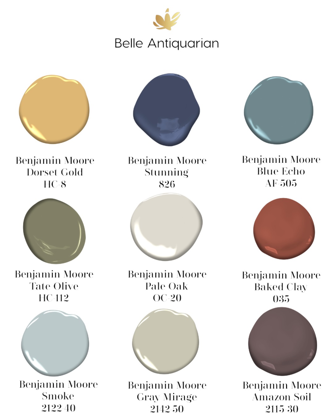
One of the reasons I wanted a really neutral kitchen color scheme is because I absolutely adore color. That sounds contradictory, but by having a neutral background I can decorate with all of my lively, colorful accessories and change them out seasonally. In today’s article I am featuring my new hot beverage station/coffee bar, which I have accessorized with colorful antique plates and a red antique rug.

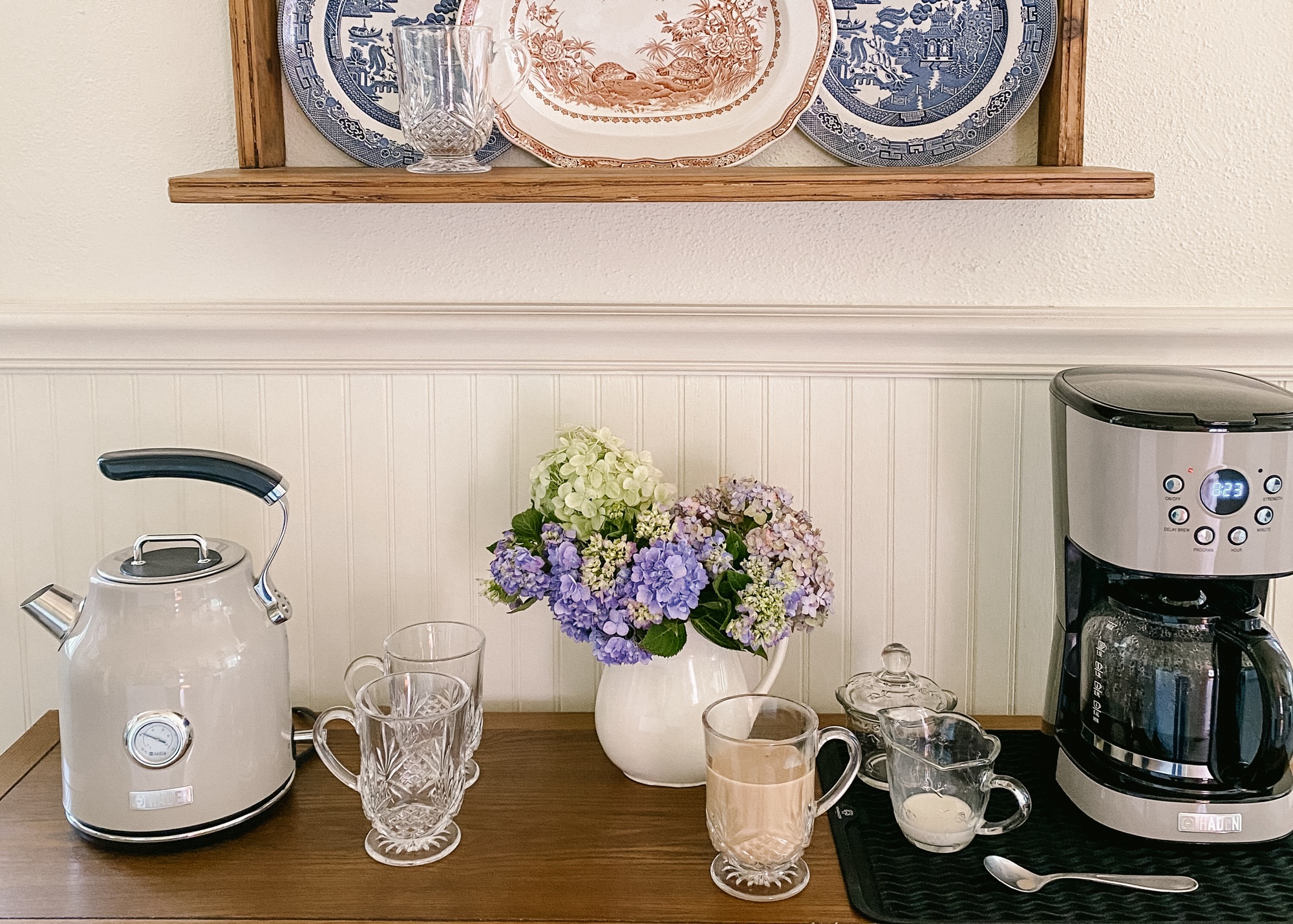
One side of our kitchen had a blank space that I needed to make functional. We considered adding a base cabinet there during our renovation, but there were a few issues. There are a door, window, and HVAC vent all along that wall. I knew I would find the perfect piece to use as a coffee bar and hot beverage station. And I did!

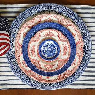
THIS gorgeous oak sideboard allows the HVAC vent to flow, while also giving me “counter” space to use for my *stunning* electric tea kettle and coffee maker. Ken and I were a little unsure about ordering a piece of furniture online. The reviews were really good, but we live in the country, and we weren’t sure about it making it here in one piece. Still, it arrived quickly and packaged extremely well to protect all of the wood. The legs did need to be attached, but we did that together in about ten minutes. The shelf underneath provides extra storage that would be good for cookbooks or a basket like this one. The plate rate that I’m using above the sideboard is an antique piece that I found, but I found a couple of other options HERE and HERE.

Not only do I have more counter space to use as a coffee bar, but the 4 drawers and 2 doors are very deep. I have room to store my tea bag organizers, coffee grounds, filters, and mugs and glasses. I’m protecting the sideboard surface under the coffee maker with a silicone mat. This keeps me from worrying about spills on the beautiful wood.

The only one who loves my red antique rug more than me is Annie. I found a really similar rug that I know you’ll love, too.

Want to find almost everything that I’ve pictured and featured? You can do so in 3 different ways: click the links above in the article, click HERE for my LTK shop, or click HERE for my Lowe’s Storefront.

Rich, Saturated Bedroom Design Plan

Hi, there! Today I am sharing a recent bedroom design plan. This design is good for someone that likes to periodically change out their bedding and décor accessories. Let me share why below:

You can find each of these commissionable links by clicking the photo.

In this bedroom design plan I used neutral furniture and window treatments. These furniture pieces are the foundation of a backdrop that allows someone to change out colorful bedding and accessories without having to completely overhaul their room. If you are the type of person that likes to switch things up, I recommend investing in quality, timeless furniture pieces while finding budget friendly bedding and accessories.

To Recap: 1. Keep your furniture and window treatments neutral and timeless. 2. Opt to spend more on furniture and window treatments since you will be using them longest. 3. Choose budget friendly items for things that you might want to switch out seasonally or periodically.

As always, you can find these exact pieces on my LikeTOknow.it page. You can click HERE or click on the picture above to find the commissionable links. Tip: The artwork pieces shown are one-of-a-kind original paintings. If you wish to purchase them, don’t delay!

Design Plans – Getting Started and Art

Today I am sharing a few of the design boards that I worked on this week. Sometimes people will tell me they don’t know where to start when decorating a space. It can be especially challenging if you are working with a blank slate and no existing pieces. If you feel stuck, I recommend focusing on picking just one piece of furniture. Once you do that, you can build the other selections around it. For each of the designs below, I started with a statement piece of furniture a desk, a bed, etc. For most of the designs below, I started with a statement piece arm chair. As always, you can click on any picture to find the sources and commissionable links for the items pictured.

This article contains affiliate links. I may earn a small commission when you use them. Thank you for supporting Belle Antiquarian.

First, I wanted to share this home office space below. These pieces are budget-friendly, all from Target. With so many students and people working from home, being organized is super important. Check out these storage solutions.

Click any picture to find commissionable links for the items in that picture.

Next, I’m sharing a bedroom design plan with an English equestrian vibe. Here you can see the bed in green, but it comes in many colors. On top of that, it’s very affordable. I also love this bedding. You will find buffalo check patterns used in designs ranging from modern to country. When you pick a versatile pattern like this one, it makes it easy to switch things out should your design taste or needs change in the future.

Click any picture to find commissionable links for the items in that picture.

Below you will find several design boards with arm chairs that I worked on this week!

Click any picture to find commissionable links for the items in that picture.

Just like in the design plan above, I often link pieces of original or antique artwork from online auctions. You may find that they are gone or sold out if you click on them. The reason that I like to link original artwork is that it makes your space feel more personal and “collected.” No one else in the world will have that piece of art, unless you are buying a print. If the painting pictured has sold, try searching for artwork you like by subject. In this case, “white horse oil painting.”

Click any picture to find commissionable links for the items in that picture.

In the design board above I used the chair as a starting point for a country design. In this design I have used 3 kinds of art: a reproduction print, an original oil painting, and a mass produced new piece. They all work together nicely. This is an option to do if you don’t have a big budget for artwork.

Click any picture to find commissionable links for the items in that picture.

Above is another room option if you are working with a smaller budget. This chair above is highly rated, and the pattern shown is currently on clearance. While the fabric of the chair is a traditional plaid, the frame of the chair is most definitely contemporary. This design could’ve gone in either direction, but in this case I went towards contemporary. You can use your imagination to see how the chair inspired this artwork choice.

The room above features an English cottage style. There is an intentional mix of fabrics in English cottage designs. You can see the block print pillows, which has recently made a huge surge in popularity. You can see a curated collection of these block print pillows, in various price points, later today on my LIKEtoKnow.it.

I hope these design boards are inspirational for you. If you are looking for sources for any of the items pictured, you can click on the picture to find my commissionable links.

Americana Interior Design style

Today I want to share with you a little about the interior design style called “Americana.” Americana style has made an enormous surge in popularity this year. But make no mistake, it is a classic design style and never really goes out of style.

Americana interior design
You can click this photo to shop the commissionable links for the items pictured.

What is Americana? Americana is actually quite a broad category of interior design. It can encompass everything from coastal Nantucket to Native American to colonial farmhouse styles. Sometimes you will find touches of each of them crossing over to each other.

This is a new kitchen made to look old. Source for photo HERE.

Americana styles of furniture can be both rough and rustic and also lean towards early American styles. You will often find a mixture of dark wood stains with some painted wood pieces. You won’t often find light wood tones in the Americana style. Americana furniture lines will almost always be very traditional rather than contemporary.

Fabrics in the Americana style will also be traditional. Southwest Americana designs often mix leather and fabrics featuring Native American designs. Coastal and farmhouse Americana styles often use grain sack, ticking, natural unbleached fibers, and chambray or denim.

Source for photo HERE.

When decorating in the Americana style, American and state flag motifs are often used on accent pieces and artwork. Other patriotic symbols can be used as well. Rugs are often made of hides or natural fiber materials.

Photo source: Pinterest. Original source unknown.

Overall, Americana is a casual, lived-in interior design style. These spaces are inviting and relaxing.

You can click the photo above to find commissionable links for the pieces pictured.

Ralph Lauren is one example of a designer with Americana style interiors. You can find many of his Americana interior design images on Pinterest or Google. Below are three books that I recommend if you are interested in seeing and learning more about Americana interior design. You can click on the captions to purchase them through Amazon or you can find them on my LiketoKnow.it HERE.

Accepting Substitutes in Your Design Plans

Today I want to talk about what to do when you fall in love with a piece for your room that blows your budget out of the water.

We’ve all been there… You find the perfect sofa, but it’s three times what you planned on spending. Or maybe it’s the dresser, or a lamp, or a piece of artwork that is not in budget. In those cases, here’s what you need to do: accept a substitute. Yes, a substitute. Or as I like to call them over on my LiketoKnow.it – a dupe. A “dupe” is a duplicate or similar item that is almost identical, but is much more affordable.

The only time that I wouldn’t try to do this is if someone is hand-crafting a custom piece for you. But if you are buying something that is not custom made, chances are you can find something very similar in a lower price point. Let me show you an example below.

You can click any picture to find the commissionable links for sources.

These two spindle chairs are so similar that if you needed to buy the less expensive one for budget reasons, your overall room aesthetic would not be affected. I recommend searching for similar wood and fabric tones to find what is in your budget. What you are probably sacrificing in these two designs is the filling material in the cushions. Below is another example of how you can find something similar to an expensive piece that fits into your own budget.

Click any photo to find the sources for what is pictured.

As you can see the most expensive bench has a white, upholstered seat with a brass frame. There are many other options that also have white, upholstered seats with brass frames. Choosing one of the more affordable options will not change the overall design aesthetic of your room.

These dressers are similar enough to equally considered for a space. Both have brass metal accents and blue textured surfaces. What I recommend in this case to carefully compared the dimensions of the pieces to make sure their size is comparable as well. In the photos below, you can see that you will often find alternatives in lower price points. Sometimes the materials used are less expensive (leather vs. vegan leather). Other times there are slight differences in the design. But when you are working on a budget, accepting a substitute item (or dupe) will sometimes solve your design dilemmas. As always you can click any of the images to find commissionable links for sources. Never miss a dupe or design plan by following my blog, following me on LiketoKnow.it, and following me on Instagram!

How to Combine Traditional with Contemporary Decor

Today I am sharing how I combine the styles of traditional and contemporary/modern in a design plan.

It’s fairly simple. When trying to combine traditional and contemporary designs, I like to keep all of the furniture lines clean and sleek. Then, I will keep all of the textiles and patterns traditional. I find that when I do these two things in a design, it turns out just right!

As you look at this dining room design board that I created below, notice that: 1) The furniture lines are sleek, clean, modern, and contemporary. 2) The fabrics, textiles, and wallpaper are traditional. You can create a happy mix of the two with your accessories and accent pieces.

Click this photo to find the sources for everything pictured on my commissionable links.

This dining table is a high-gloss white lacquer. Notice that the edges are very modern and angular. The chairs have a traditional rattan caning material, but the lines of the arms are very contemporary.

Above is the color palette used for this space. As always, everything pictured in this design has been linked on my LiketoKnow.it. You can find all of the commissionable links there.

Click the photo above to see sources and commissionable links for everything pictured.

Never miss a design plan! Be sure to subscribe to my blog, follow me on Instagram, and follow me on LiketoKnow.it!

What Are Your Thoughts on Wallpaper?

Wallpaper has come back in a big way! Some of us are thinking, “Wait, didn’t I spend hours of my life removing wallpaper?” You did, but what goes around comes around. And it’s baaaaack! Other than someone who might be considering moving soon, I say bring it on!

Wallpaper can add character, interest, and personality to any space – even your laundry room. In the design plan below, I am showing a wallpaper pattern that I picked out for a bedroom. It has a lighter background and uses several colors in the design. I feel that gives it more flexibility in furnishings for the space, but also if you want to change bedding, etc, in the future, you will have more options with a wallpaper pattern like this.

I’ve linked all of the sources for what you see in this picture on my LiketoKnow.it. You can find the commissionable links there by clicking HERE or on the photos.

The colors used for inspiration for this space are below. Even if you are not painting the walls of a room, I recommend that you have a color palette that you use. This will help you when you are picking out furniture, bedding, and artwork.

The color palette, wallpaper, and furnishings of this space were inspired by a pastoral, French country feel. These are heirloom, classic designs that don’t go out of style and can stand the test of time.

So what are your thoughts? Are you ready to wallpaper a room (or two) in your home? Or are the memories of 1980s wallpaper removal still too fresh to consider it?

You can click the photos to be find sources for everything pictured here.

Tips for Designing Bedrooms in Modern Times

What if I told you that you no longer have to commit to an entire bedroom suite like our parents did? Gone are the days of walking into a furniture store to buy a matching bed, dresser, and nightstands. You will enjoy your bedroom space more and find it more relaxing if it has a “collected” feel to it.

I want to very quickly show you one example of how you can buy new pieces that don’t “match” and combine them with antiques, as well as modern pieces. The end result is a space that will reflect your individual personality and veer away from the cookie cutter bedroom suite of decades gone by.

Sources for all of these pieces are linked on my LiketoKnow.it. Click the picture to see more.

The first suggestion I have for creating a cohesive, collected look is to be intentional with your color palette. Search for and save a color palette that you like on Pinterest so that you can easily access it while shopping. Another option is to keep your paint chips in your wallet so that you can reference them quickly.

You will want to stick to your color palette for things like art, bedding, rugs, and furniture. If you wander from your color palette, the item you choose will boldly look out of place. You’ll find it visually disruptive to have it in your space, and you’ll become frustrated with your design.

The next tip I have is to pay attention to symmetry and scale. For example, if you are trying not to use nightstands that match perfectly, I suggest that they have something in common to tie them together. They should have similar size and color to balance the design. You don’t want one nightstand to be white and 30″ x 36″, while the other one is stained brown and is 28″ x 18″.

Those are all of the quick tips that I have for you today! I have linked sources for all of the pieces above on my LiketoKnow.it page. You can find all of the commissionable links there. To make sure that you don’t miss out on future design advice, you can subscribe to my blog, follow me on Instagram, and follow me on LiketoKnow.it.

Click the photo to see all of the sources for these pieces on my LiketoKnow.it.

One Color Palette, Two Spaces, Two Budgets

Hello! Just wanted to post really quickly with an example of how one color palette can be used in two different spaces and two different budgets. I put together the color palette below for someone that requested a natural, yet modern, look.

These colors may be altered by your screen. Please view them in person before purchasing.

In the first space I used the color palette for an apartment that came mostly furnished. The budget for this space was around $1600. Click HERE to find the sources for the items below.

In the second space I have again used this color palette for a living room. The budget was more substantial for this space. Click HERE to find the sources for the pieces below.

All of the sources for both of the spaces can be found on my LiketoKnow.it. You can find my commissionable links there, or you can click on either picture to be taken there directly.

Patriotic Summer Decor

Patriotic Summer Decor

Red, white, and blue can carry you Memorial Day through Labor Day.

One of the reasons I love decorating for the summer is I know that once I have my home all decorated I can leave it up for a long time. If you break out all of your red, white, and blue patriotic decor in May for Memorial Day, you can have your home decorated for flag day in June, Fourth of July, and all the way until Labor Day in September.
I have one storage bin with some Fourth of July and patriotic decorations. I will also “shop” my home for some other red, white, or blue items. I also like to include seashells, because they remind me of summer. I like to think of seashells as a neutral color. I even use them to check off the “white” if I am missing that in a red, white, and blue vignette.
Layer china patterns for a patriotic look. How cute are these Allerton’s Blue Willow individual butter pat dishes?
I like to use red Coca-Cola crates, vintage Pyrex bowls, books, and napkins for “red”. Blue canning jars, picture frames, and Blue Willow china are perfect for “blue”. White seashells, milk glass dishes, and anything silver will make your “white”.
Use seashells you picked up on the beach for filler.

Another tip I have is one that I use for every holiday. Shop the after-holiday clearance sale. I’ve had this bunting and these “fans” for a couple of years in my storage bin. I found them on clearance at Target a few years back.
Everyday items grouped together in red, white, and blue combinations suddenly turn into patriotic decor. I used a Blue Willow teapot, a red transferware platter, and some red & white flowers to make this grouping.
20190706_114351
Summer makes me so happy! I hope you find joy in this season as well.