Traditional home design with connected rooms, layered rugs, and warm natural materials.

Traditional Home Design: Five Foundational Elements That Last

The highest compliments I have gotten as an interior designer were when my grown kids asked me for advice when decorating their own homes. Even when they were very small, I took them with me to go sourcing antiques for our home and my retail spaces.

Over the years they absorbed the importance of quality construction and materials. They know that if you buy a quality piece of furniture or decor, that you may not ever have to replace it in your lifetime.

People often confuse traditional home design with being old-fashioned. On the contrary, timeless home design is created by using classic elements that never go out of style.

The homes that stay relatable throughout the decades often have less to do with trends and more to do with the decisions that shape them over time.

What Defines Traditional Home Design

Labels are used frequently when talking about interior design. Contemporary, minimalist, and traditional are all terms you’ve likely seen online and in magazines. So, what exactly is traditional home design?

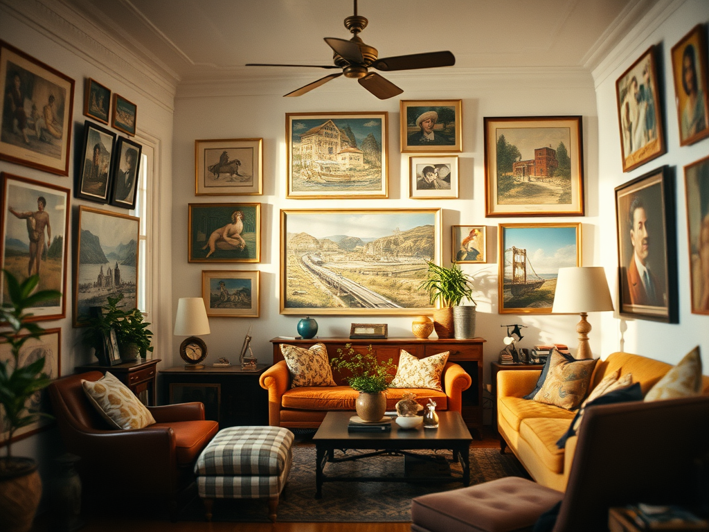
The word traditional is used to describe decor that often has a European influence. Traditional home decor often emphasizes symmetry.

Other elements that are trademarks of traditional interior design are layering of fabrics and patterns, curved and ornate wood carvings, and pieces that have been collected over time.

Spaces with traditional home design are a reflection of who lives there. At the heart of traditional home design is an understanding that rooms should feel visually balanced before they are ever fully decorated.

Proportion and Scale in Traditional Interior Design

If you’ve ever walked into a room and felt something about the decor was amiss, but you couldn’t put your finger on what it was, it was probably because something was off with the proportions or scale in the room.

Traditional dining room with carved wood table, patterned rug, and collected wall decor.
Traditional interiors often rely on proportion, natural materials, and collected details that feel layered over time rather than purchased all at once.

After moving into a new house, a friend told me, “I love this sofa so much, but no matter where I put it in the new living room, it just doesn’t look right.”

The problem wasn’t finding the right space for it, and there was nothing wrong with the sofa itself. The issue was that the sofa was purchased to fit in her last house, and it was entirely too big for her new space.

In traditional decor, designers often use the 2/3 rule of scale and proportion. This rule gives a pleasing sense to the eye as you take in the space as a whole. Large rooms can handle larger pieces of furniture, and in turn, smaller spaces need furniture on a smaller scale.

When scale is handled well, a room feels comfortable almost immediately, even if the viewer can’t explain exactly why.

Materials that Shape Timeless Home Design

The most successful traditional designs use materials that could have either been installed yesterday or one hundred years ago, and it’s difficult to know which it is.

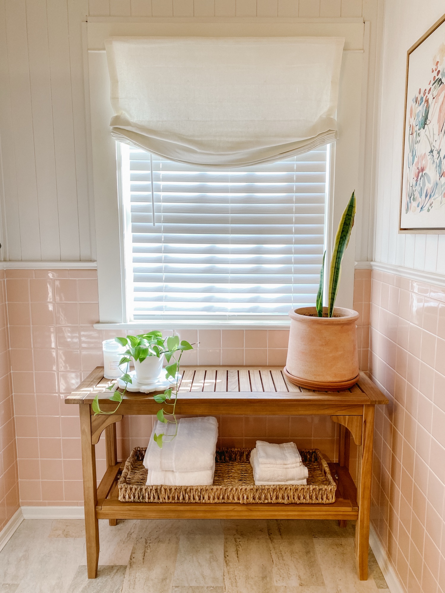
Many of the materials associated with traditional homes share two qualities. First, they’re made of something found in nature, like wood, stone, linen, or leather. Second, they’re crafted from something man-made that can stand the test of time, like brass, copper, bronze, or nickel.

Choosing materials that are often found in traditional home decor will result in a timeless home design. As a bonus, these are often superior materials that not only withstand trends, but also physical wear and tear.

Over time, these materials also help create continuity throughout a home, allowing rooms to feel connected rather than separate from one another.

Creating Continuity in Traditional Home Decor

I remember watching the television show Trading Spaces, where neighbors would swap houses to redecorate one room with the help of a designer. As seasons went on, the designs became wild and unrealistic for everyday living.

The room reveals on the show often featured an outlandish space that the designer used to showcase their own creativity, instead of the tastes of the homeowner. As a result, these new rooms never blended with the rest of the house.

Traditional home design showing continuity between adjoining rooms with layered artwork and warm wood tones.
One of the defining characteristics of traditional homes is the sense of continuity between rooms rather than dramatic shifts in style or color.

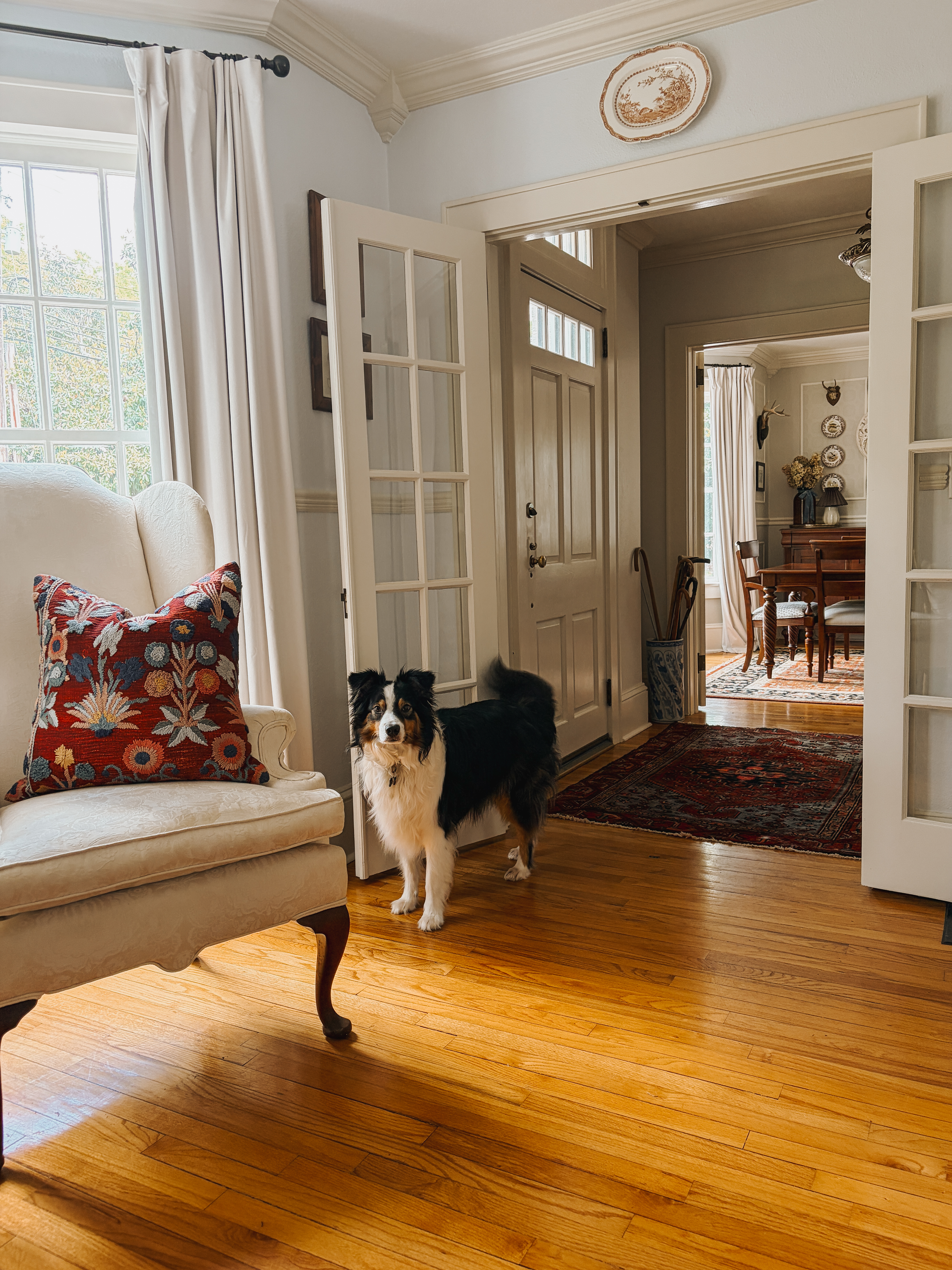
In traditional homes, rooms are rarely treated as isolated spaces. Whole house color palettes create a smooth flow without disruptive color changes.

Using uninterrupted flooring finishes and repeating decor elements throughout homes also  creates continuity in traditional home decor. Traditional homes are often memorable not because of a single room, but because the entire house feels connected in both design and purpose.

Functional Layouts in Traditional Homes

In traditional interior design, floorplans have dedicated spaces for each living function. Rooms are designed to fulfill a purpose in the home, and the purposes of adjoining spaces are considered for how they relate to each other.

A kitchen will be designed for optimal workflow, but the kitchen design will also consider the placement and decor of the dining room, since the two often function in tandem.

In a classic home design, a living room layout will function to encourage conversation, and a bedroom layout will be designed to be peaceful and relaxing.

While decorating styles may shift over time, the ways people gather, cook, rest, and converse remain remarkably consistent.

A Collected Sense of Time in Traditional Homes

I love watching renovation shows on TV that surprise the homeowners with a brand new, completely styled room that they always fall in love with at the end. But the truth is that’s not always reality.

Traditional bedroom with antique wood bedside table, patterned textiles, layered artwork, and soft lamp lighting.
Traditional homes often feel collected rather than perfectly coordinated, with furnishings, artwork, and personal objects accumulated gradually over time.

Some people hire an interior designer to redo an entire room in their home. But there are far more people who call designers for help with one thing: draperies for a bedroom, a new sofa and loveseat with custom fabric, or flooring.

As you are making changes to your home, you’re also picking up a piece of art here and there, a basket to hold throw blankets in the living room, or a secretary desk to organize books and stationery in the corner of a study.

Classic home elements aren’t just beautiful; they tell a story that’s been written over time. Perhaps this is why traditional homes rarely feel finished all at once; they are shaped gradually through years of living.

Vintage books and blue-and-white ceramics styled on built-in shelving in a traditional home.
Collected interiors rarely feel overly matched; instead, they reflect years of retained books, furnishings, and meaningful objects.

How to Apply Traditional Home Design in a Real Home

Traditional homes tend to resist short-lived trends in favor of choices that remain appealing over time. In recent years there was an explosion of popularity in barn doors and vinyl plank flooring. These were new and exciting ways to decorate a home, but they weren’t enduring. Classic home decor is beautiful in any era, regardless of what is trending on the internet.

Traditional homes rarely feel assembled all at once, which is one reason perfectly matched furniture suites can feel overly uniform. Unmatched pieces can beautifully complement each other for a more collected look.

The most important thing to remember when creating a home with classic pieces is to go slowly. It’s okay if rooms are incomplete while you search for the right pieces to tell your home’s story.

Why Traditional Home Design Endures

As trends move faster online, interiors have also become more vulnerable to cycles of rapid consumption and replacement.

With instant access and saturation of influence on the internet, home furnishings and décor have become disposable. Composite materials and cheap construction mean that many things purchased today won’t be around in ten years.

Timeless home design endures because of quality craftsmanship and materials that last a lifetime. Traditional interior design considers functionality and cycles of everyday living, not what savvy influencers tell you is trending. Homes built slowly and thoughtfully often remain relevant far longer than those shaped by rapid cycles of consumption.


Check out these other reader favorites:

Traditional home design with connected rooms, layered rugs, and warm natural materials.
Traditional homes are often memorable not because of a single room, but because the entire house feels connected in both design and daily living.

How to Update a 1930s Bathroom Without Losing Its Charm

Updating a historic bathroom doesn’t have to mean losing its original charm. Our 1939 bathroom still features the vintage wall tile and fixtures that first caught my heart, but a few thoughtful additions gave the space new life. By keeping the original tile and layering in a teak table, relaxed roman shade, coordinating artwork, and a touch of live greenery, I created a bathroom that feels both timeless and livable. If you’ve ever wondered how to refresh a 1930s bathroom without replacing its historic character, you’ll love this approach. I’ve also included a Benjamin Moore color palette inspired by the original tile, perfect for anyone looking for bathroom design inspiration rooted in history.

Historic Bathroom at First Glance

The first time I saw the main bathroom in our 1939 Colonial Revival Home, I knew it wasn’t living up to its full potential. It’s a rather large bathroom for its era, full of the original soft peach tile on the walls and in the shower. The original bathtub is cast iron with a porcelain enamel finish. It’s very large compared to modern bathtubs. These were elements that I found to be valuable and desirable while looking for a historic home to purchase, and I wanted to honor them in my design.

The bathroom as it looked when toured prior to purchasing the house.

When we viewed our home prior to purchasing it, the large space under the window had a tiny vanity and some wall shelves. After purchasing it, I wanted to update it in a way that made it more functional, while keeping the vintage charm typical in a 1930s and 1940s home. Since nothing was broken, I was able to update without replacing anything major.

The walls in the whole bathroom have peach-colored tile. In this photo you can see a built-in storage cabinet that is set into the wall.

Refreshing a 1930s or 1940s Bathroom

As you might guess, the peach tile was the springboard for the whole design. This color might have been a reason other homeowners would have ripped it out. However, I knew that finding the right paint color to complement the peach would create a better feeling in the space. For the walls above the tile, I went with Benjamin Moore China White OC-141.

Again playing with peach tile, I leaned in a bit to the orange tones, and selected a teak table to place under the window. I also added a relaxed roman shade over the window blinds to soften the edges of the window. A lucky find, the seagrass basket was a clearance rack find, and it fits perfectly on the bottom shelf of the table.

Next, I added a few plants to the space. The live greenery adds a spa-like touch, and brings in green as an accent color. The last selection that I made for this design was the artwork. It’s the only artwork in our whole house that isn’t an original piece, but it brings together all of the colors in this bathroom perfectly.

Best Paint Colors for Bathrooms with Vintage Tile

The color palette for this bathroom is built around the original 1939 bathroom tile. For a similar color in wall paint, use Benjamin Moore Clementine Rose 1219. A complementary neutral trim color is Benjamin Moore China White OC-141. If you’re looking for an accent color that pairs well with the other two colors, try Benjamin Moore Paris Rain 1501.

Adding Modern Comfort to a Historic Bathroom

I hope this inspires you to rethink a total remodel. There are many ways to add modern comfort to a historic bathroom without gutting it. For us, the space functions well and the original tile and fixtures are in fantastic condition. (What you might not be able to tell is that the built-in cabinet is set deep into the wall, so we didn’t have a need to create additional bathroom storage.)

I know there’s a temptation from social media, TV, and Pinterest to “update” every space that isn’t decorated in a modern way. But the best way to truly honor a historic home is to allow it to be what it was built to be. Most historic homeowners will embrace the imperfections and charm of designs from by-gone eras.

The finished design. A 1930s vintage bathroom with modern comfort and classic accessories.

Shop This Look

If you see something you like in this design that you’d like to incorporate into your own space, you can find many of the items linked HERE for shopping.

Click to Shop

While You’re Here…

While you’re here, I hope you’ll take a few minutes to “look around” and read a few of our other articles. We’re currently in a series called Falling for Home: A Weekly Autumn Journal, which is all about falling in love with our own homes again as we meander through the autumn season together.

Let me know what you think of these bathroom colors in the comments below. Would you ever live with peach colored tile?

Essential Elements for a Beautiful Entryway

It’s the beginning of a new month, which means it’s time to release another designed space. This month’s design plan features an entryway 3 ways: casual, formal, and transitional.

This article contains affiliate links and ads. You can find the products I recommend by clicking on the links throughout and at the bottom of this page. These are designs that you can pick and choose which elements to bring into your own spaces. They’ll be saved here on my website, or you can save them on Pinterest. You can come back and add pieces to your spaces as time and budgets allow.

This month I am sharing what I consider to be the perfect recipe for a successful entryway design. The best entryways have the following essential elements in common:

  • a functional piece of furniture
  • a lamp
  • artwork
  • a mirror
  • storage/catchall
  • something alive/fresh
  • a rug
  • a clock
  • and a place to set a wet umbrella.

Not only do these items create a beautiful space, but they are functional as well. For example, the mirror allows residents and guests to check their appearance before coming and going, as well as reflecting light into the space. A lamp allows residents to find their way inside on a dark night, as well as helping guests find the door on their way out.

Below you can see a colorful and vibrant entryway design. Since the entryway is the first impression of your home, it’s an opportunity to create a space that reflects your personal style. This design leans more towards casual and bohemian. It is full of visual interest and layers of texture. Combining two separate pieces, like the green and white plate and the pink framed artwork, you can create a one-of-kind, original piece of art in your home that no one else will have. Try using Command brand hooks to mount the plate on top of the pink art before hanging it on the wall.

Click the photo to shop for these exact items.

Traditional decor thrives on symmetry. The design below uses symmetry to create balance by flanking the mirror with matching lamps and plates from the same series. While the first design is considered modern and casual, I would consider the design below to be formal.

Click the photo to shop for these exact items.

Entry Table

Below you will find the final entryway design for this month. Notice how similar metal tones and a soft ivory color are carried throughout. Natural materials like wicker, marble, and wood counterbalance the glamorous gold and brass to create a sophisticated but approachable space. This design is a midway point between casual and formal.

Click the photo to shop for these exact items.

In many cases, the front door to the home opens directly into the living space without a designated foyer or entryway. In these situations it’s possible to create an entryway by grouping specific items on a wall next to the front door. Are you missing any of these essential items in your entryway? Do you have any items in your entryway that you would add to this list? Let me know in the comments below.

Never miss a design release in the future by subscribing using the box at the bottom of this article.

You can find many of these items in my LTK Storefront HERE.

Transforming Our Breakfast Room: A Makeover Journey

Today I am sharing some before and after pictures of the breakfast room in our 1939 home. This is the casual dining space in our home that we use for our everyday meals, playing board games, and doing puzzles.

Our breakfast room is off of the kitchen, and has also has a door to the center hallway on the main floor. One of the things we love about living in a house that is not open concept, is that we can dedicate rooms to the functions we need and completely close the room by shutting the doors to it.

Before, the previous homeowners used this space as a family room.
After, we restored the space to its original purpose, a breakfast room.

The previous owners were using this room as a family room. They were using a sectional sofa that took up the entire room. The walls were painted a sherbet orange color with a lighter orange color on the ceiling. The only light in the room was a pendant fixture that was so dark we couldn’t tell if it was on unless we opened the yellow glass shade.

Before, a large sectional filled the entire room.
After, the space is restored to its original purpose, a breakfast room.

We transformed this space by painting the walls Benjamin Moore “Pale Oak” and the ceiling “White Dove.” Our general contractor gave us a handmade stained glass shade that his father had made. The shade is far from perfect and a little uneven on the edges, but we loved it for this space. I found a pendant online that could accommodate the shade.

The orange paint colors on the walls and ceiling were not appropriate for the room. The windows have south and west sun exposure, which means direct light comes into the room for most of the day. As a result everything in the room took on an orange glow. Combined with a light fixture that wasn’t functional, this was a space that no one in our family wanted to be in.

After I corrected the color on the walls and installed a functioning light fixture, the breakfast room was completely transformed. The total cost was around $250 for the paint and a pendant fixture. The breakfast room isn’t completely done. We’re on the hunt for a very specific table and chairs. I’m also deciding what to put on one of the walls. But I wanted to share how simply changing the paint and lighting can completely change a room.

I’d love to see how you transform your own spaces with paint. Be sure to tag me on Instagram or comment below to share your photos!

American Living Room Design Plan: Warmth and Style

It’s the beginning of a new month, which means it’s time to release another designed space. A few weeks ago I took a poll on Instagram, and the majority of followers voted for this month’s design to feature a living room.

This article contains affiliate links and ads. You can find the products I recommend by clicking on the links throughout and at the bottom of this page. These are designs that you can pick and choose which elements to bring into your own spaces. They’ll be saved here on my website, or you can save them on Pinterest. You can come back and add pieces to your spaces as time and budgets allow.

In most American homes, the living room is the space in the house where a family will gather to sit and relax together. Living rooms provide the perfect opportunity to show your style and to incorporate pieces that reflect your personal flair. In this living room design plan, I’ve purposely used multiple sources for the items featured. I want to discourage you from walking into a furniture showroom and buying a completely matching living room set. In order to create a collected aesthetic that is a unique reflection of your style, you’ll need to pull together pieces from different sources.

Click the photo to shop this design.

Design preferences are FINALLY moving away from sterile, all-white or gray interiors. The design I’m featuring today is warm and evokes a feeling of “home” with saturated and inviting colors. The wall color for this living room design is Shaker Beige, HC-45, from the Benjamin Moore historic color collection. On the floor you will find a timeless selection of traditional hickory hardwoods. Using Shaker Beige and hickory hardwoods as the base for our design, we begin to layer in warmth and richness, starting with a woven Persian rug.

The sofa in this month’s design is fully customizable. After choosing the basic shape of the sofa, I selected the number of cushions, fabric, cushion filling, and feet. The feet selected are walnut stained feet with brass castors. The fabric shown is “Atlantic Performance Blakely.”

At this point in the design, we have the base in which to start adding complementary furniture, art, and accessories. I added some leather armchairs and walnut end tables that echo back to the lines of the traditional sofa. The elegant coffee table pairs well with the metal accents on the sofa feet.

The table lamps in this living room design are ones where a visitor might wonder if they’re new or if they were found on an antiquing adventure.

I selected window treatments and an art piece for this space that pull from the colors found in the rug, sofa, and wall color. If you’re only able to change one thing in your living room, try finding a new art piece that will unify the other colors used in your space.

The final layer in this living room design plan is for accessories. Accessories are such a fun way to inject personality into your space. Here I have used conversation pieces that add texture and interest.

You can find the sources for each of the items that I recommend below. Never miss a design release in the future by subscribing using the box at the bottom of this article.

You can find many of these items in my LTK Storefront HERE.

Discover Benjamin Moore’s Color of the Year 2025

It’s the beginning of a new month, which means it’s time to release another designed space. This month features a new bedroom design, which has been inspired by the Benjamin Moore color of the year and color trends palette for 2025.

This article contains affiliate links and ads. You can find the products I recommend by clicking on the links throughout and at the bottom of this page. These are designs that you can pick and choose which elements to bring into your own spaces. They’ll be saved here on my website, or you can save them on Pinterest. You can come back and add pieces to your spaces as time and budgets allow.

Benjamin Moore recently released their color of the year and a color trends palette for 2025. (Read more on the Benjamin Moore site HERE.) I designed a space using 4 of these colors, and I want to show you how simply changing the wall color can drastically change the whole room. The Benjamin Moore color of the year for 2025 is Cinnamon Slate 2113-40. In addition to Cinnamon Slate, I incorporated some of Benjamin Moore’s color trends for 2025: Sea Salt CSP-95, Paris Rain 1501, and Tissue Pink 1163.

In the first design plan I’m featuring Cinnamon Slate as the wall color. Cinnamon Slate is a deeply saturated and sophisticated hue that can be treated as a neutral when taken care not to overwhelm the space with competing colors. Because Cinnamon Slate is the star of this design, we can carefully add selections that keep the space calm and serene. I found a piece of wall art that unites all four of the paint colors that I’m featuring today. This artwork is integral to creating a cohesive design. The furniture and other decor pieces are either very neutral and without pattern, or they only have a pattern that includes colors from the color palette that I’m featuring. With Cinnamon Slate as a backdrop, the other design selections are noticeable individually as they pop away from the darker color.

Wall color Cinnamon Slate. Click the photo to shop this design.

In the next design I have kept all of the exact selections from the design above, but I have simply switched out the wall color from Cinnamon Slate to Paris Rain. I absolutely love Paris Rain. It has been one of my go-to color selections for years. I urge you to get a color swatch in person, because you will love it, too. The silk draperies, which are barely a whisper of pink, like Tissue Pink in our color scheme, become a direct complementary color to Paris Rain, as they are opposites on a color wheel. In this design, Cinnamon Slate transitions to an accessory color in the bowl, lamp, and artwork.

Wall color Paris Rain. Click the photo to shop this design.

Again we are going to keep the exact same design, but this time we can see how it would look if the walls are painted Tissue Pink. I think Tissue Pink is a very palatable pink. It’s an excellent option if you want to warm a space up, while still keeping it neutral. Notice how the selections change with Tissue Pink as the background. The lamp, draperies, and rug are all unique accessories, but with a similarly toned wall color like Tissue Pink, we can start to feel more on the monochromatic end of the spectrum.

Wall color Tissue Pink. Click the photo to shop this design.

Lastly, let’s look to see how the design changes when we change the wall color to Sea Salt. Sea Salt is the lightest hue in the palette that I’m featuring today. In this design, the artwork, accessories, and rug become the stars of the show. This is a good example of showing that often choosing a lighter paint color changes the focus of the room onto the things that are in it. If you have artwork and collections that you want to spotlight, a lighter paint color may be the best option for you.

Wall color Sea Salt. Click the photo to shop this design.

Each of the design selections for this room can be found linked below. Now that you have seen the same room in four different colors, I want you to slowly scroll back up. In each room, focus only on the artwork above the bed. Notice how the artwork works perfectly in each room, and yet as the paint color changes the artwork looks somehow different in each one. Ah, the power of paint! As I said at the beginning, the artwork is integral to this design.

Paint is one of the easiest ways to change a room, and it’s important to select the right color for your space. As you can see, it can completely change the entire design.

You can find the sources for each of the items that I recommend below. Never miss a design release in the future by subscribing using the box at the bottom of this article.

You can find many of these items in my LTK Storefront HERE.

Top Sources for Original Artwork in Collected Design

This post contains commissionable links and ads.

If someone were to ask me what my interior design style is, I would say “collected.” Collected interior spaces are ones that can rarely be rushed or quickly pulled together, so they range from feeling as though they are not finished to sometimes being a little overly done. People who resonate with collected interior design are ones who wish to have their personality reflected in their spaces by featuring a mixture of old and new pieces, original artwork, items collected from travels, and multiple design styles.

Of all of these characteristics of collected interior design, the one that resonates the most with me is original artwork. Do you remember that fear of showing up to a homecoming dance and seeing another girl wearing the same exact dress as you? That’s how I feel about potentially walking into someone’s home and seeing the same exact mass produced artwork hanging on the wall.

In our family, artistic ability was highly treasured and encouraged. In my large, extended family I have multiple family members with an incredible gift for all types of artwork, ranging from jewelry design to painting to large scale commercial art installations. It’s for these reasons that I have found myself drawn to purchasing original artwork over the years to decorate my homes with.

Until now, I have closely guarded my source for much of this artwork. Today, for the first time ever, I am sharing where I have purchased original artwork for many years and a list of tips so that you can also find amazing pieces for your home or business. This began as a source that I used when I was a seller in the antiques industry. Initially, I kept this source close to the chest because sourcing artwork to resell can be difficult. Then, I kept quiet about it because I didn’t think people would take it seriously.

So are you ready for it? My source for a great deal of the original artwork in my home is GoodwillFinds.com. I know, I KNOW. Not what you were expecting, right? Let me tell you why this website has been such a success for me. You can discover hundreds of hard-to-find pieces and hidden gems. I have purchased a massive painting for $30, which turned out to be worth over $3,000. I purchased my treasured dog painting that you’ve seen in many pictures for only $100. And the best part? No one in the world has a painting exactly like mine.

Logo 468x60

Here are just a few tips for successfully buying artwork on GoodwillFinds.com:

  • I’m listing this tip first because it’s often overlooked. Make sure you read the description carefully, especially the dimensions. You don’t want to be surprised when it’s delivered by receiving something much smaller or much larger than you expected.
  • Read to see if there is anything regarding delivery you need to know.
  • Before you start searching the website, create an account!
  • Use the search features wisely! At the top of the website is a search box, and you can also click on the top left to view by categories. Artwork can be found under the home category.
  • It can take a bit of digging to find something that you want to own and be proud of. Since artwork is unique and items are constantly being added, check back often to see what’s new on the website.

I hope you found this information helpful, and I wish you much success in your hunting! I have a few promo codes that will work for first time shoppers below. I was very hesitant to share this source, and my husband was actually surprised when I told him that I was going to. It would bring me great joy if you would share your finds with me in the comments or tag me on social media. (Facebook, Instagram) Happy hunting!

Promo codes:

Logo 300x100

Bedroom Interior Design Plan: Collected Woodland Retreat

I’ve decided to start releasing some designed spaces once a month. Each month I will share at least one room design with sources that everyone has access to. This month I am going to share a bedroom and a bathroom design.

This article contains affiliate links and ads. You can find the products I recommend by clicking on the links throughout and at the bottom of this page.

I’ll be sharing paint colors, products, and tips that will be helpful if you want to implement this bedroom design in your own home. These are designs that you can pick and choose which elements to bring into your own spaces. They’ll be saved here on my website, or you can save them on Pinterest. You can come back and add pieces to your spaces as time and budgets allow.

I created this bedroom to be an enchanting woodland retreat with a mixture of textures, soft colors, and natural elements. The combination of natural wood tones and painted pieces gives the impression of a space that has been collected over time.

This solid wood spindle bed is a classic design that will truly become a family heirloom. As mentioned above, mixing natural wood tones and painted pieces creates a collected feeling. These end tables make excellent nightstands. They have a slightly aged patina. Be sure to note the design on the top before adding to your cart.

The art in this bedroom space is in keeping with the collected and found mood we are creating. The rabbit print, faux antlers, and book collection are 3 different ways to bring art into the design in a demure, unassuming way.

It’s easy to create a luxurious bedding ensemble and avoid the “bed in a bag” look by layering complementary linens. I recommend using the quilt as a base. Fold the gorgeous blue duvet and leave it at the end of the bed during the day. These throw pillows bring in another layer of soft texture.

The lighting I selected for the room is an example of how the juxtaposition of metal and natural fibers can work together to create a pleasing aesthetic. The chandelier and lamp work like a dream in this bedroom design. I encourage you to layer the lighting in each of your spaces using ambient, task, and accent fixtures.

Finally, we come to the walls and the floor. In this space I have featured a two-tone wallpaper with a nature inspired design. Wallpaper is not for everyone, so you can certainly use paint instead. I like Benjamin Moore “White Sand” 964 with these pieces, but you should select a color that’s right for your spaces using the light in your particular room. On the floor in this design I have chosen a floral rug. This particular rug is essential to the design because it pulls all of the colors from the room together.

You can find the sources for each of the items that I recommend below. Never miss a design release in the future by subscribing using the box at the bottom of this article.

You can find many of these items in my LTK Storefront HERE.

Create Your Dream Bathroom: Tips & Sources

I’ve decided to start releasing some designed spaces once a month. Each month I will share at least one room design with sources that everyone has access to. This month I am going to share a bedroom and a bathroom design.

This article contains affiliate links and ads. You can find the products I recommend by clicking on the links throughout and at the bottom of this page.

I’ll be sharing paint colors, products, and tips that will be helpful if you want to implement this bathroom design in your own home. These are designs that you can pick and choose which elements to bring into your own spaces. They’ll be saved here on my website, or you can save them on Pinterest. You can come back and add pieces to your spaces as time and budgets allow.

I created this bathroom with the idea that it can blend with multiple design styles, while also being timeless. I want to help you select finishes and furnishings that can stand the test of time. Let’s move away from “fast fashion” in home decor and move towards selecting heirloom choices that will be loved for decades.

This design features two different tiles. The first tile is a basket weave pattern with natural marble stone. This tile can be used on both walls and floors. It’s a classic in both pattern and material. The second tile is a matte gray slate. This slate tile is approved for both wall and floor application, but I only recommend it for floors in this case. We want to avoid using the slate tile on walls and showers because it will create a trendy aesthetic.

Next, I selected a versatile and transitional bathroom vanity. The vanity is available in two colors, gray and white, and either color would be appropriate for this design. The vanity is available with one or two sinks, and it features a real, natural marble counter top. The holes are pre-drilled on the vanity, so I selected a faucet that will fit and complements the hardware on the vanity cabinet.

As I move on to lighting, I want to encourage you to consider laying lighting, even in your bathroom. I selected an overhead light for ambient light, as well as sconces for next to the mirrors. The sconces will give better lighting for makeup application and using the mirror, so those are our task lights. In addition to these, you could also add a little counter top lamp.

The apothecary storage cabinet, the art, stool, and plant are beautiful pieces that pull the entire design together. These are also the pieces that you could switch in and out if you want to change your decor up without a costly renovation. (I am obsessed with this black swan print and trying to work it into my own decor somehow.)

For this space, I recommend to paint with Benjamin Moore “Wish” AF-680. Remember, this is a suggested paint color for the space. You should choose a paint color that is best for your bathroom.

You can find the sources for each of the items that I recommend below. Never miss a design release in the future by subscribing using the box at the bottom of this article.

You can find many of these items in my Lowe’s Storefront HERE or my LTK Storefront HERE.

Transform Your Dining Room on a Budget

This article contains affiliate links and ads. You can find many of the pieces I feature by clicking on the links at the bottom of this article.

I’m happy to finally share the details on our dining room refresh. Months before our kitchen renovation began, we started on our dining room. This was a low cost project that we completed over a long weekend. With some paint, new draperies, an estate sale find, and collected antiques from the storage bins, I created a dining room that we look forward to hosting holiday dinners in.

The homeowner that did all of the major renovations on our home in the early 2000s painted it a sherbet green with a lighter shade of green on the ceiling. The seller we purchased it from didn’t make any changes to the dining room at all. Every room was kept exactly the way it was when they bought the house, right down to where the nails in the wall were. It was important to me to make this OUR home, and painting is an easy way to do that without changing the style and architecture of a historic home.

One of the changes we made with the biggest impact was to paint the ceiling. If you’re considering painting your ceilings a lighter shade of the wall colors, pause and think twice. Not necessarily because of resale value, but think of how you want people to feel while they’re in your home. If you’re wanting a dramatic effect and an artistic environment, then go for it! But if you want people to feel relaxed and settled, it’s not for you. It’s distracting and chaotic if it’s not done properly.

We painted our walls with Benjamin Moore “Revere Pewter,” and the ceiling is “White Dove.” The trim is Behr “China White.” The trim was already painted for us, and I like how it works with the Revere Pewter. China White reminds me of the color of antique ironstone dishes.

When we sold our last house three years ago, we sold most of our furniture, including the dining room table, chairs, and china cabinet. The rental house we were moving to didn’t have a dining room, and the dining set was looking a little dated, so we sold it on Facebook Marketplace. After we bought this house, I found an estate sale that was selling an Ethan Allen dining set for less than 1/10th of the retail cost. It’s currently on the Ethan Allen website, and the total cost for the table, 8 chairs, and buffet would’ve been over $11,000. We paid around $1,000. It’s worth it to check out estate sales!

I featured the drapery and hardware on an Instagram post several months ago. The drapery and hardware ended up being a source of frustration. The bay windows in our house do not match the measurements of modern bay windows. Modern bay windows have a larger center window with a smaller functional window on each side. Our original historic bay windows have a smaller center (functional) window, with a larger stationary window on each side. The drapery and hardware for our bay windows were custom made to fit them. And unfortunately, they were removed by the seller. I ended up finding hardware and drapery that I preferred, but it was time and money that we weren’t expecting to spend.

The other items in the room, like plates, pitchers, and artwork, are things that I’ve collected over the years. It was a little like Christmas opening all of my boxes that had been in storage for three years, and we’ve only had one broken crystal glass so far!

I’m lucky to have two pieces of artwork by my twin brother, Tyrus Lytton, displayed in our dining room. He painted a portrait of our daughter when she was two or three, and I found a frame online that complemented the antique mirror on the other side of the doorway. He also painted a small watercolor of our house. (Side note: my brother normally does large scale art installations all over the world. I’m very proud of him and thankful to have some of his artwork on a smaller scale.)

Below you can find a list of sources for the items that I used in our dining room. Some of the pieces are antiques, but I have linked similar ones that I found online. Click on the word to be taken to the source where you can find them.

P.S. There are also a few side-by-side- before and after photos below.

As you can see, a little paint and some new draperies can make a big impact. I’m curious if you’ve ever purchased a house and had items removed that were supposed to stay. Let me know in the comments if you’ve experienced that, too!

Until next time,

Abby