How to Update a 1930s Bathroom Without Losing Its Charm

Updating a historic bathroom doesn’t have to mean losing its original charm. Our 1939 bathroom still features the vintage wall tile and fixtures that first caught my heart, but a few thoughtful additions gave the space new life. By keeping the original tile and layering in a teak table, relaxed roman shade, coordinating artwork, and a touch of live greenery, I created a bathroom that feels both timeless and livable. If you’ve ever wondered how to refresh a 1930s bathroom without replacing its historic character, you’ll love this approach. I’ve also included a Benjamin Moore color palette inspired by the original tile, perfect for anyone looking for bathroom design inspiration rooted in history.

Historic Bathroom at First Glance

The first time I saw the main bathroom in our 1939 Colonial Revival Home, I knew it wasn’t living up to its full potential. It’s a rather large bathroom for its era, full of the original soft peach tile on the walls and in the shower. The original bathtub is cast iron with a porcelain enamel finish. It’s very large compared to modern bathtubs. These were elements that I found to be valuable and desirable while looking for a historic home to purchase, and I wanted to honor them in my design.

The bathroom as it looked when toured prior to purchasing the house.

When we viewed our home prior to purchasing it, the large space under the window had a tiny vanity and some wall shelves. After purchasing it, I wanted to update it in a way that made it more functional, while keeping the vintage charm typical in a 1930s and 1940s home. Since nothing was broken, I was able to update without replacing anything major.

The walls in the whole bathroom have peach-colored tile. In this photo you can see a built-in storage cabinet that is set into the wall.

Refreshing a 1930s or 1940s Bathroom

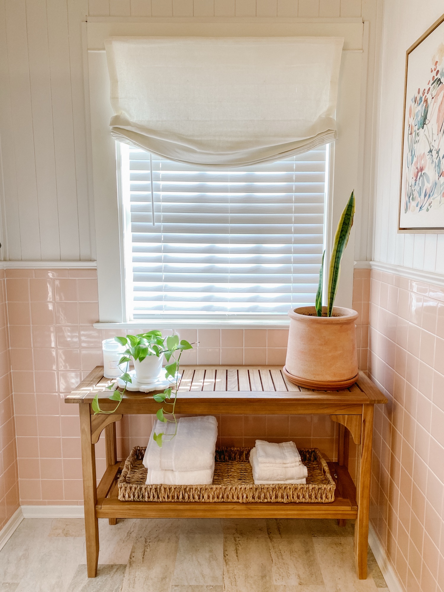
As you might guess, the peach tile was the springboard for the whole design. This color might have been a reason other homeowners would have ripped it out. However, I knew that finding the right paint color to complement the peach would create a better feeling in the space. For the walls above the tile, I went with Benjamin Moore China White OC-141.

Again playing with peach tile, I leaned in a bit to the orange tones, and selected a teak table to place under the window. I also added a relaxed roman shade over the window blinds to soften the edges of the window. A lucky find, the seagrass basket was a clearance rack find, and it fits perfectly on the bottom shelf of the table.

Next, I added a few plants to the space. The live greenery adds a spa-like touch, and brings in green as an accent color. The last selection that I made for this design was the artwork. It’s the only artwork in our whole house that isn’t an original piece, but it brings together all of the colors in this bathroom perfectly.

Best Paint Colors for Bathrooms with Vintage Tile

The color palette for this bathroom is built around the original 1939 bathroom tile. For a similar color in wall paint, use Benjamin Moore Clementine Rose 1219. A complementary neutral trim color is Benjamin Moore China White OC-141. If you’re looking for an accent color that pairs well with the other two colors, try Benjamin Moore Paris Rain 1501.

Adding Modern Comfort to a Historic Bathroom

I hope this inspires you to rethink a total remodel. There are many ways to add modern comfort to a historic bathroom without gutting it. For us, the space functions well and the original tile and fixtures are in fantastic condition. (What you might not be able to tell is that the built-in cabinet is set deep into the wall, so we didn’t have a need to create additional bathroom storage.)

I know there’s a temptation from social media, TV, and Pinterest to “update” every space that isn’t decorated in a modern way. But the best way to truly honor a historic home is to allow it to be what it was built to be. Most historic homeowners will embrace the imperfections and charm of designs from by-gone eras.

The finished design. A 1930s vintage bathroom with modern comfort and classic accessories.

Shop This Look

If you see something you like in this design that you’d like to incorporate into your own space, you can find many of the items linked HERE for shopping.

Click to Shop

While You’re Here…

While you’re here, I hope you’ll take a few minutes to “look around” and read a few of our other articles. We’re currently in a series called Falling for Home: A Weekly Autumn Journal, which is all about falling in love with our own homes again as we meander through the autumn season together.

Let me know what you think of these bathroom colors in the comments below. Would you ever live with peach colored tile?

Transform Your Dining Room on a Budget

This article contains affiliate links and ads. You can find many of the pieces I feature by clicking on the links at the bottom of this article.

I’m happy to finally share the details on our dining room refresh. Months before our kitchen renovation began, we started on our dining room. This was a low cost project that we completed over a long weekend. With some paint, new draperies, an estate sale find, and collected antiques from the storage bins, I created a dining room that we look forward to hosting holiday dinners in.

The homeowner that did all of the major renovations on our home in the early 2000s painted it a sherbet green with a lighter shade of green on the ceiling. The seller we purchased it from didn’t make any changes to the dining room at all. Every room was kept exactly the way it was when they bought the house, right down to where the nails in the wall were. It was important to me to make this OUR home, and painting is an easy way to do that without changing the style and architecture of a historic home.

One of the changes we made with the biggest impact was to paint the ceiling. If you’re considering painting your ceilings a lighter shade of the wall colors, pause and think twice. Not necessarily because of resale value, but think of how you want people to feel while they’re in your home. If you’re wanting a dramatic effect and an artistic environment, then go for it! But if you want people to feel relaxed and settled, it’s not for you. It’s distracting and chaotic if it’s not done properly.

We painted our walls with Benjamin Moore “Revere Pewter,” and the ceiling is “White Dove.” The trim is Behr “China White.” The trim was already painted for us, and I like how it works with the Revere Pewter. China White reminds me of the color of antique ironstone dishes.

When we sold our last house three years ago, we sold most of our furniture, including the dining room table, chairs, and china cabinet. The rental house we were moving to didn’t have a dining room, and the dining set was looking a little dated, so we sold it on Facebook Marketplace. After we bought this house, I found an estate sale that was selling an Ethan Allen dining set for less than 1/10th of the retail cost. It’s currently on the Ethan Allen website, and the total cost for the table, 8 chairs, and buffet would’ve been over $11,000. We paid around $1,000. It’s worth it to check out estate sales!

I featured the drapery and hardware on an Instagram post several months ago. The drapery and hardware ended up being a source of frustration. The bay windows in our house do not match the measurements of modern bay windows. Modern bay windows have a larger center window with a smaller functional window on each side. Our original historic bay windows have a smaller center (functional) window, with a larger stationary window on each side. The drapery and hardware for our bay windows were custom made to fit them. And unfortunately, they were removed by the seller. I ended up finding hardware and drapery that I preferred, but it was time and money that we weren’t expecting to spend.

The other items in the room, like plates, pitchers, and artwork, are things that I’ve collected over the years. It was a little like Christmas opening all of my boxes that had been in storage for three years, and we’ve only had one broken crystal glass so far!

I’m lucky to have two pieces of artwork by my twin brother, Tyrus Lytton, displayed in our dining room. He painted a portrait of our daughter when she was two or three, and I found a frame online that complemented the antique mirror on the other side of the doorway. He also painted a small watercolor of our house. (Side note: my brother normally does large scale art installations all over the world. I’m very proud of him and thankful to have some of his artwork on a smaller scale.)

Below you can find a list of sources for the items that I used in our dining room. Some of the pieces are antiques, but I have linked similar ones that I found online. Click on the word to be taken to the source where you can find them.

P.S. There are also a few side-by-side- before and after photos below.

As you can see, a little paint and some new draperies can make a big impact. I’m curious if you’ve ever purchased a house and had items removed that were supposed to stay. Let me know in the comments if you’ve experienced that, too!

Until next time,

Abby

Hot Beverage Station/Coffee Bar

This post includes affiliate links and ads. You can find all of the exact pieces that I feature by clicking the links.

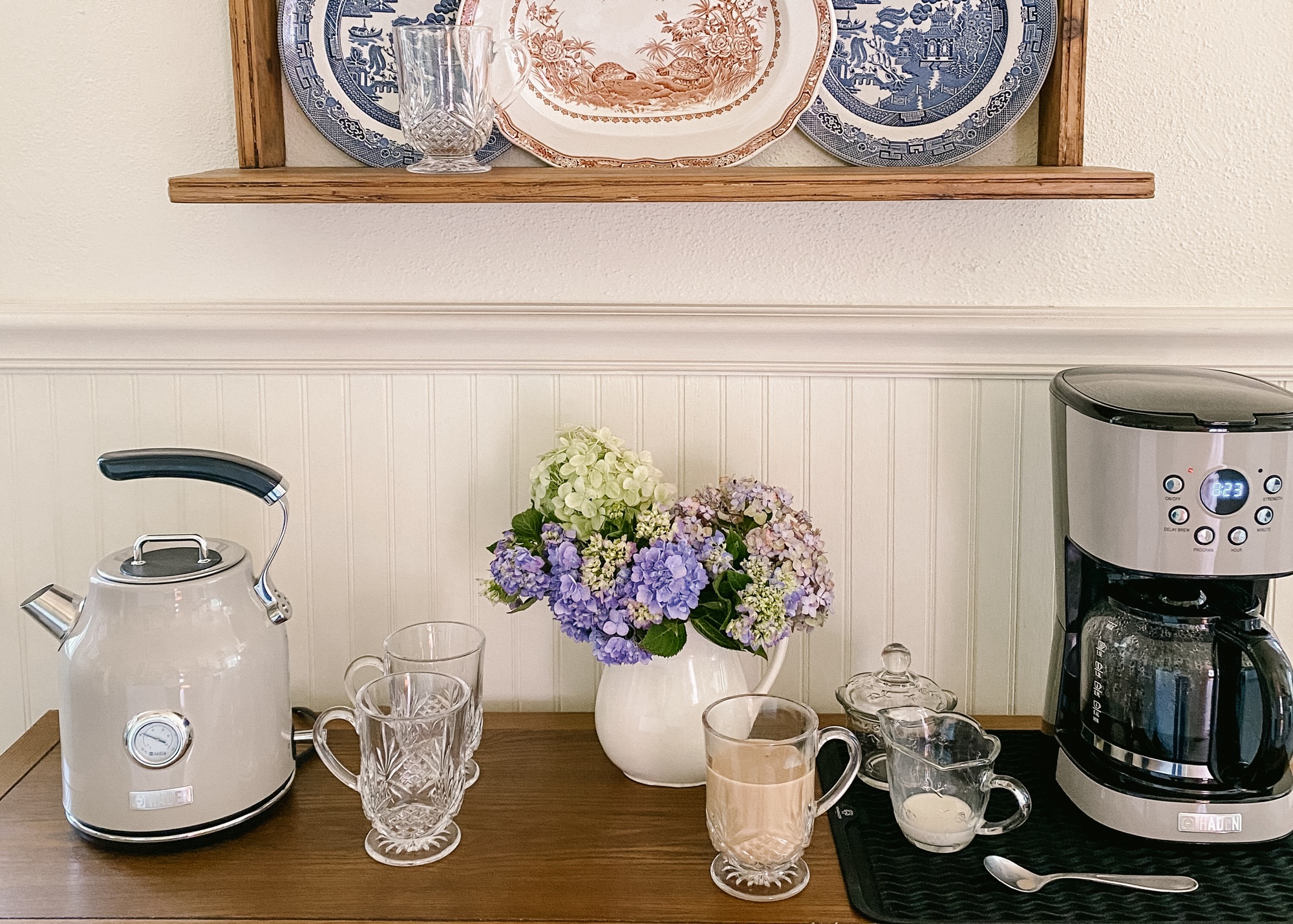
One of the reasons I wanted a really neutral kitchen color scheme is because I absolutely adore color. That sounds contradictory, but by having a neutral background I can decorate with all of my lively, colorful accessories and change them out seasonally. In today’s article I am featuring my new hot beverage station/coffee bar, which I have accessorized with colorful antique plates and a red antique rug.

One side of our kitchen had a blank space that I needed to make functional. We considered adding a base cabinet there during our renovation, but there were a few issues. There are a door, window, and HVAC vent all along that wall. I knew I would find the perfect piece to use as a coffee bar and hot beverage station. And I did!

THIS gorgeous oak sideboard allows the HVAC vent to flow, while also giving me “counter” space to use for my *stunning* electric tea kettle and coffee maker. Ken and I were a little unsure about ordering a piece of furniture online. The reviews were really good, but we live in the country, and we weren’t sure about it making it here in one piece. Still, it arrived quickly and packaged extremely well to protect all of the wood. The legs did need to be attached, but we did that together in about ten minutes. The shelf underneath provides extra storage that would be good for cookbooks or a basket like this one. The plate rate that I’m using above the sideboard is an antique piece that I found, but I found a couple of other options HERE and HERE.

Not only do I have more counter space to use as a coffee bar, but the 4 drawers and 2 doors are very deep. I have room to store my tea bag organizers, coffee grounds, filters, and mugs and glasses. I’m protecting the sideboard surface under the coffee maker with a silicone mat. This keeps me from worrying about spills on the beautiful wood.

The only one who loves my red antique rug more than me is Annie. I found a really similar rug that I know you’ll love, too.

Want to find almost everything that I’ve pictured and featured? You can do so in 3 different ways: click the links above in the article, click HERE for my LTK shop, or click HERE for my Lowe’s Storefront.

Our 1939 Kitchen Remodel

I’m excited to be working directly with Lowe’s Home Improvement to share many of the kitchen selections I used during my recent kitchen remodel. As a Lowe’s affiliate, I get a commission on the links I share in this article.

We lived in our 1930s home for several months before beginning the remodel, and we were surprised to discover how much we enjoyed it not being an open floor plan. It’s really nice having spaces with dedicated purposes and doors we can close off when we want to. I had originally considered knocking down the wall in between the kitchen and the breakfast room, but decided to use the existing work triangle that a former homeowner had established. (We’ll update the breakfast room in a few months with built-in seating and storage.)

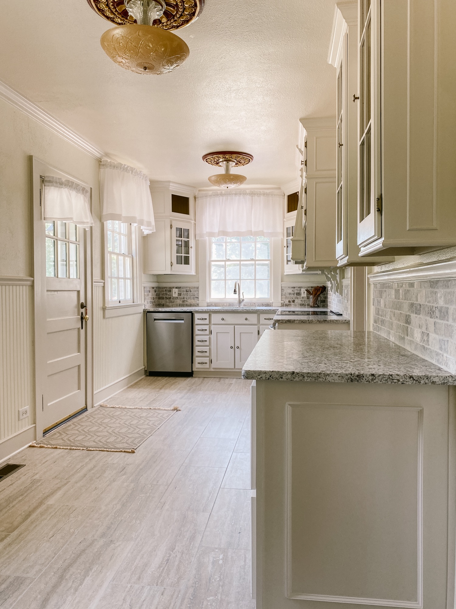
In photos the kitchen is deceptively small. It’s actually quite functional at about 20 feet by 10 feet. After deciding to keep the existing work triangle, my focus shifted to adding countertop work surfaces, removing and updating the tile countertops and backsplash, and removing and replacing a very early version of laminate flooring. The oven and dishwasher were completely broken, so we needed to update those as well.

After selecting and purchasing all of the materials myself, I hired a general contractor to coordinate all of the demo and installation, as well as to build us another lower countertop. We had a thorough inspection before buying our home, but we still held our breath during the demo process. There’s never a guarantee that we wouldn’t uncover problems when we started the remodel. Thankfully, we didn’t have any surprises!

I chose to shop with Lowe’s for most of our materials because they offer a 10% discount to military veterans. Since Ken is an army vet, we qualified for their savings. The floor tile I selected has a marble look with both warm and cool tones. It’s waterproof, chemical and stain resistant, pet-friendly, and has a limited lifetime warranty. (Spoiler alert: I used this same tile in the sleeping porch remodel that I’ll feature in a future article.) It’s just an overall great product for high traffic areas. Coincidentally, I had originally picked out a tile from a specialty tile store. On my way to pay for the tile, I happened to stop at Lowe’s to look at grout colors, and I found this floor tile. It was an almost *exact* match. That stop into Lowe’s saved me over $1,000. (I chose Mapei grout in alabaster for both the floor tile and backsplash.)

The countertops and backsplash were both the same, outdated, early 2000s tile. The fruit basket design over the range was not the type of history that I’m trying to preserve. yikes. I understand how budgets are limited, so I encourage everyone to wait and save for solid surface countertops than to install something impractical or trendy. At one time, these tile countertops were in fashion. The backsplash is another amazing Lowe’s find of travertine subway tiles. Due to it being a natural product, color can definitely vary, but I was pleased to find that each of the boxes I purchased had both warm and cool tones in it. For my countertops I selected leathered granite in “Arctic White” for my countertops. The slab I picked, again, has warm and cool tones in it.

So those are all of the pretty, fun things to pick out, but we definitely had some functionality issues with the kitchen. I don’t know how the sellers were eating, cooking, or cleaning. The dishwasher leaked; the oven didn’t work; and the faucet wouldn’t stay on for more than 60 seconds. I ended up picking out an induction range that I have fallen in love with. Water boils faster than the gas stove that I used for years. The dishwasher is a silent dream of a work horse. The sink and faucet fit in perfectly with the size and style of our kitchen.

The transformation is pretty remarkable. I kept costs down by keeping the existing layout and not moving electrical and plumbing. The most expensive part of my remodel was adding a lower cabinet for pots and pans. (The former homeowners used furniture there.)

Buying my materials from Lowe’s saved us thousands of dollars. You can find all of the Lowe’s products that I mentioned in this article in my Lowe’s storefront. Finally, how’s this for a before and after?

Since the remodel has been finished, I’ve added an antique rug and a hot beverage station that I’ll be sharing in a future article. In the meantime, I share real-time progress every day on my Instagram stories. Please come over and follow me there – I’d love to meet you.

See you soon,

Abby

Welcome to Our New Home

original artwork by Tyrus Lytton

This year we moved to a new home in a small town about an hour away from where Ken and I were born and raised. While this may not seem like a big move, it’s quite an adjustment only having one grocery store to choose from. After three years of searching for the perfect historic home for us, we found one to settle in and make our own. A former homeowner completely updated the wiring, plumbing, and basement during an early 2000s remodel. (That was good news for us!) But, the most recent homeowner neglected to keep up with basic historic home maintenance, so we have a lot of things to do, like re-glazing all of the original (working) windows, refinishing the original iron railings (there are a lot of them), and taming the overgrown property full of invasive plants.

This is the original brick color. It has not been painted or lime washed.

In the coming months, I’ll be sharing how we are updating and caring for our almost 85 year old home. Since the major mechanical systems have been updated, many of the updates I’m making are considered cosmetic. I’ll be sharing the planning process and the exact materials I’ve used. The process I’m using and selections that I’m making are timeless, which means they will look wonderful in my home and yours, too.

This is the original brick color. It has not been painted or lime washed.

As you follow along, keep in mind that I am working to create a backdrop that can stay in place for decades to come long after I’m gone. Tile, flooring, and countertop selections are not exact copies of what a homeowner would use in a 1930s home, but they are reminiscent of colors and materials that could have been selected. My home is in a town that would have been very rural and agricultural, so “modern” art deco themes wouldn’t have been used. As I showcase rugs, furniture, and accessories, please remember that I am not aiming to create a museum-like atmosphere. While my style is certainly traditional, I am not actively seeking period pieces to fill my home.

Tomorrow I will be sharing our kitchen remodel, which includes countertops, backsplash, flooring, appliances, and adding an extra lower cabinet. In the meantime, I share quite a bit more on Instagram if you’d like to see more real-time progress. See you then!

Abby