Feminine nightstand with lamp, carafe, small art, storage boxes, candle, and basket.

Home as a Haven: How to Create a Cozy Bedroom Retreat

Welcome back to the sixth installment of our weekly Friday series called Falling for Home: A Weekly Autumn Journal. Each week we explore ways to embrace the softness of the autumn season, create a welcoming environment to restore your spirit, and fall in love with our own homes again. If you’re just joining me here from Google, Pinterest, or Instagram, I invite you to read the other segments in this series, which can be found linked at the bottom of this article.

As the season progresses, we begin to lose daylight hours and the temperatures cool. The sun is setting earlier each day, and we begin to retreat indoors.

Today we’ll start a conversation on the importance of intentionally curating a personal haven in your home and creating a place to restore yourself… not just a place to crash at the end of the day to get some sleep.

The bedroom as a whole reflects the balance of function and comfort: closed storage to keep clutter tucked away, restful art, and layered bedding that invites you to linger.

Step One: Clear the Space for Peaceful Rest

Many of my readers are the family’s nurturers, often putting everyone else’s needs before their own. In the home, this translates into prioritizing the shared family spaces and even the children’s bedrooms. Our bedrooms become the catch all and dumping grounds for all the miscellaneous items that don’t have a designated spot. The clean laundry is often brought into our bedrooms until it can be folded and put away later.

Not only does this create physical clutter; it creates mental clutter and unrest in the very space that we retreat to get rest.

Create Processes

We need processes for dealing with items that make their way into our bedrooms. I like to use a method called “Touch it once.” For example, if I’m taking laundry out of the dryer, then dumping it on my bed, then moving it to a chair to fold it later, I’ve touched it 3 or 4 times before it gets put away. By folding each item as I take it out of the dryer, I will touch it only once before it gets put away. Doing it this way might not feel like it in the beginning, but it becomes a lot less work.

Look around your bedroom to assess miscellaneous piles of clutter. Those are the items that you’ll need to create a new process for. When we move piles of clutter from one spot to another to clean, we’re just moving the mess around and not actually taking care of the mess.

Essential Items

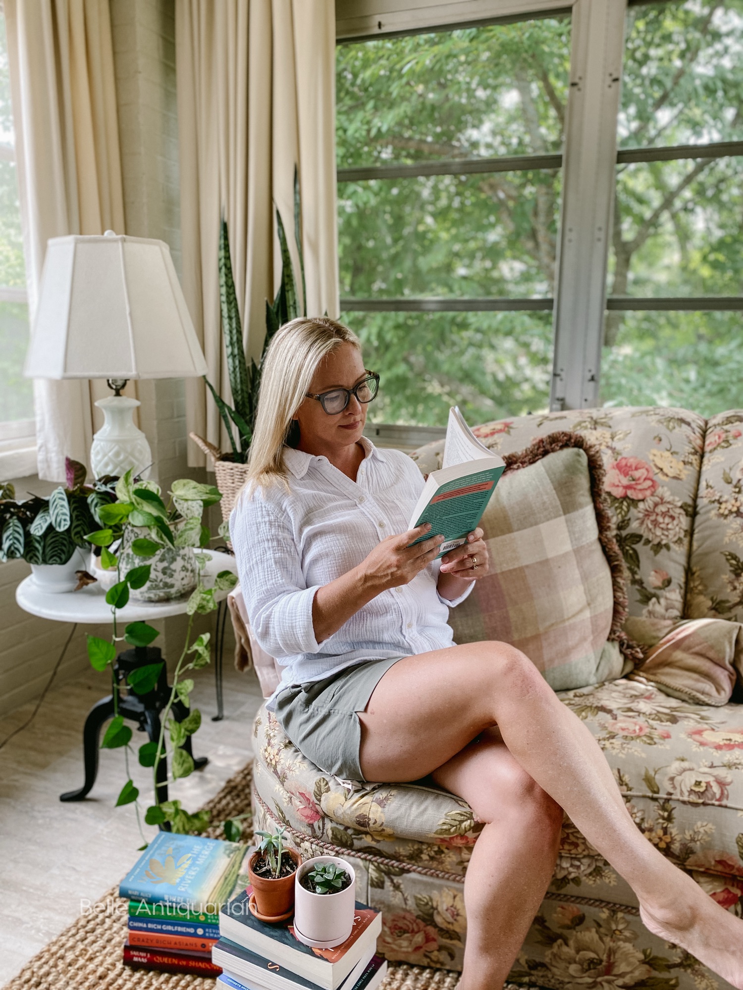
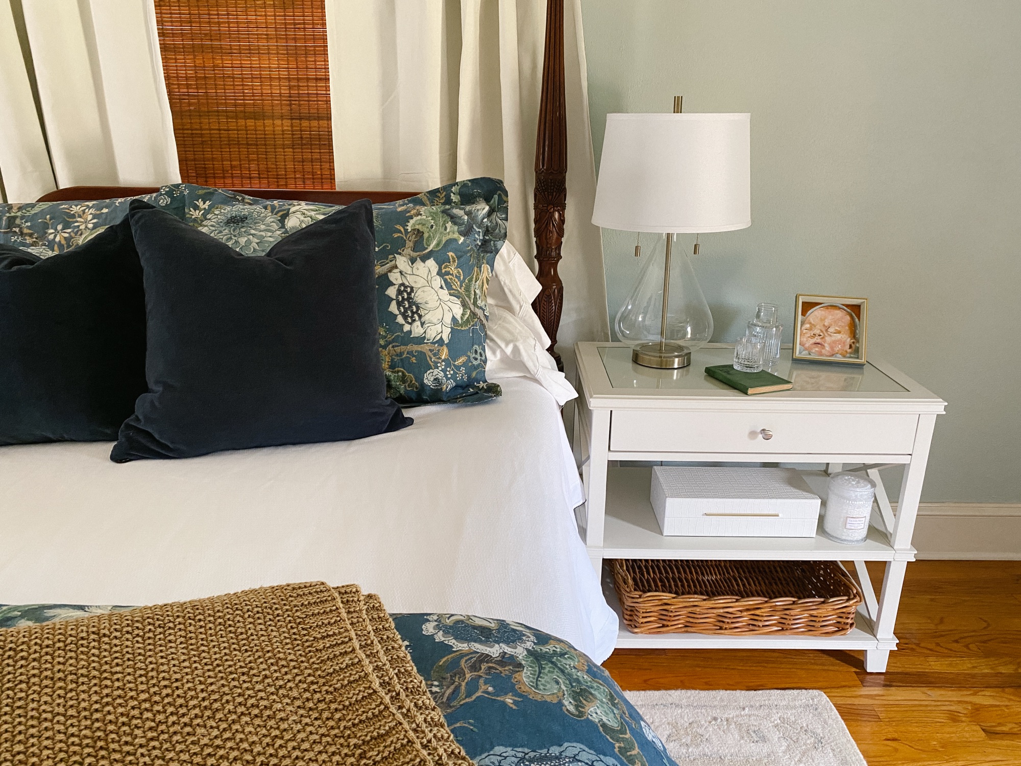
Next, I recommend that you only keep the essential items within sight. These would be things that support the rest, comfort, or function of your bedroom. For example, you’ll need a bedside table of some sort, a lamp within reach of your bed, and a hamper to hold your dirty laundry. Other examples are a throw blanket that gets used on chilly nights or a fan that cools you in warm weather. Essential items are ones that directly help you rest, prepare for the day, or feel comforted. If it distracts you, nags at you, or simply takes up space without providing function, it doesn’t belong in your bedroom.

Daily Items

In addition to essential items, we all have daily items, which I recommend organizing into closed storage containers. These items are practical, not decorative, and by placing them into closed storage containers we are able to keep surfaces peaceful without disrupting our routine. Examples of daily items would be chargers, medications, skincare, books, and pajamas. When each item has a designated space in a closed storage system, we easily prevent clutter from snowballing into piles. Items are still convenient and within reach; they’re just not visually tiresome or nagging.

Implementing these habits can take a little practice. However, you’ll find that if you consistently maintain these methods, it will be well worth the effort when you have a peaceful, relaxing space at the end of the day.

On his side of the bed: a leather catchall, favorite books, and a wood box for everyday necessities, proof that practicality can be handsome when it’s well-contained.

Step Two: Add Meaningful & Personal Touches

Your bedroom is probably a place that most guests won’t see. And if you’re a parent, it may be the one space in your home that’s truly yours. Your bedroom is an opportunity to create a room with décor that reflects your personality and sentimentality. By carefully selecting your furnishings and accessories, you can build an area for yourself that makes you feel at home.

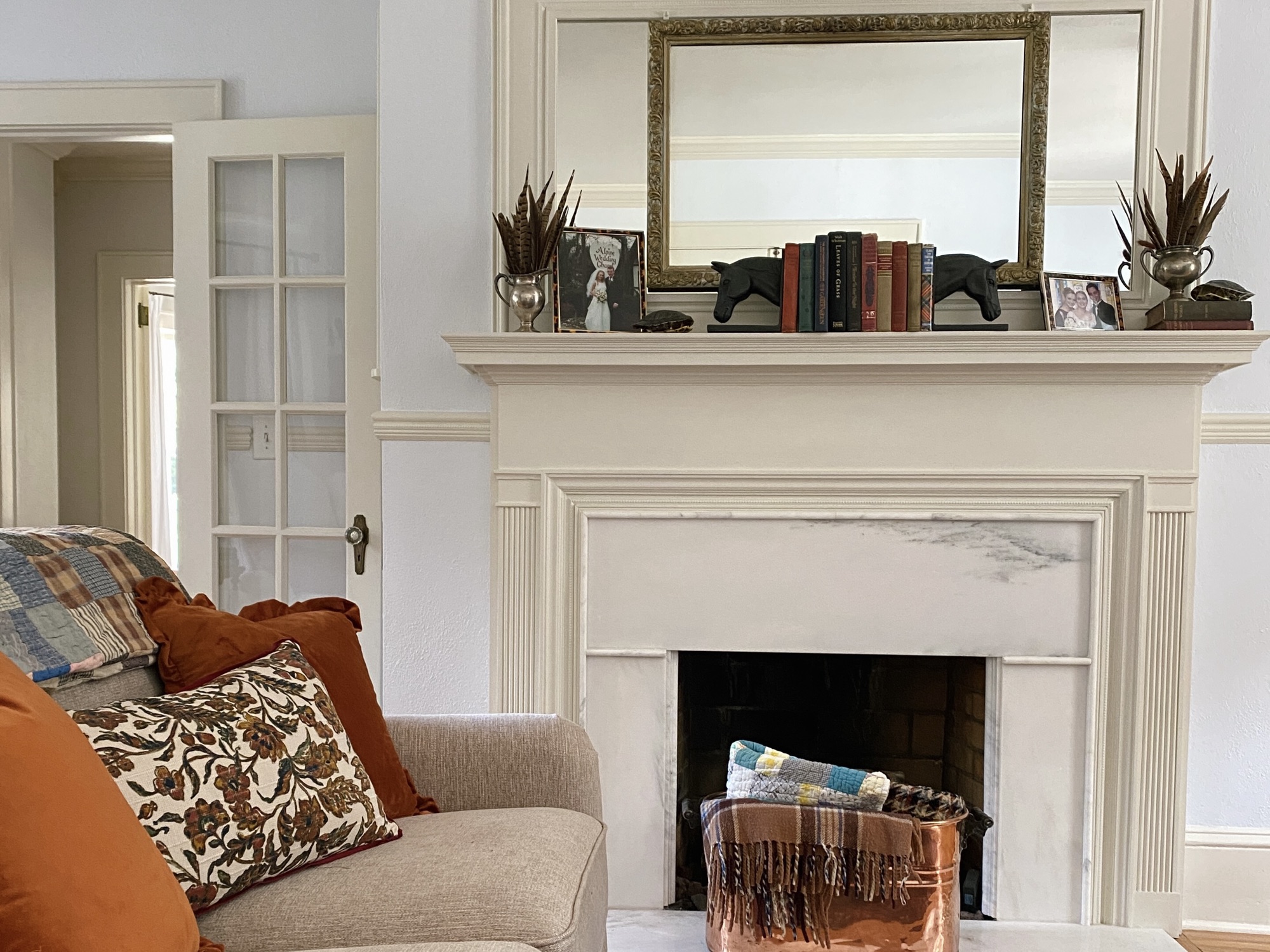
Adding personal touches to your bedroom should be done with simplicity, restraint, and sentimentality. For example, a gallery wall of art or family photos creates too much stimulation and interest in a space that is intended for relaxation. Instead, try adding a small family photo in a frame on your nightstand or dresser.

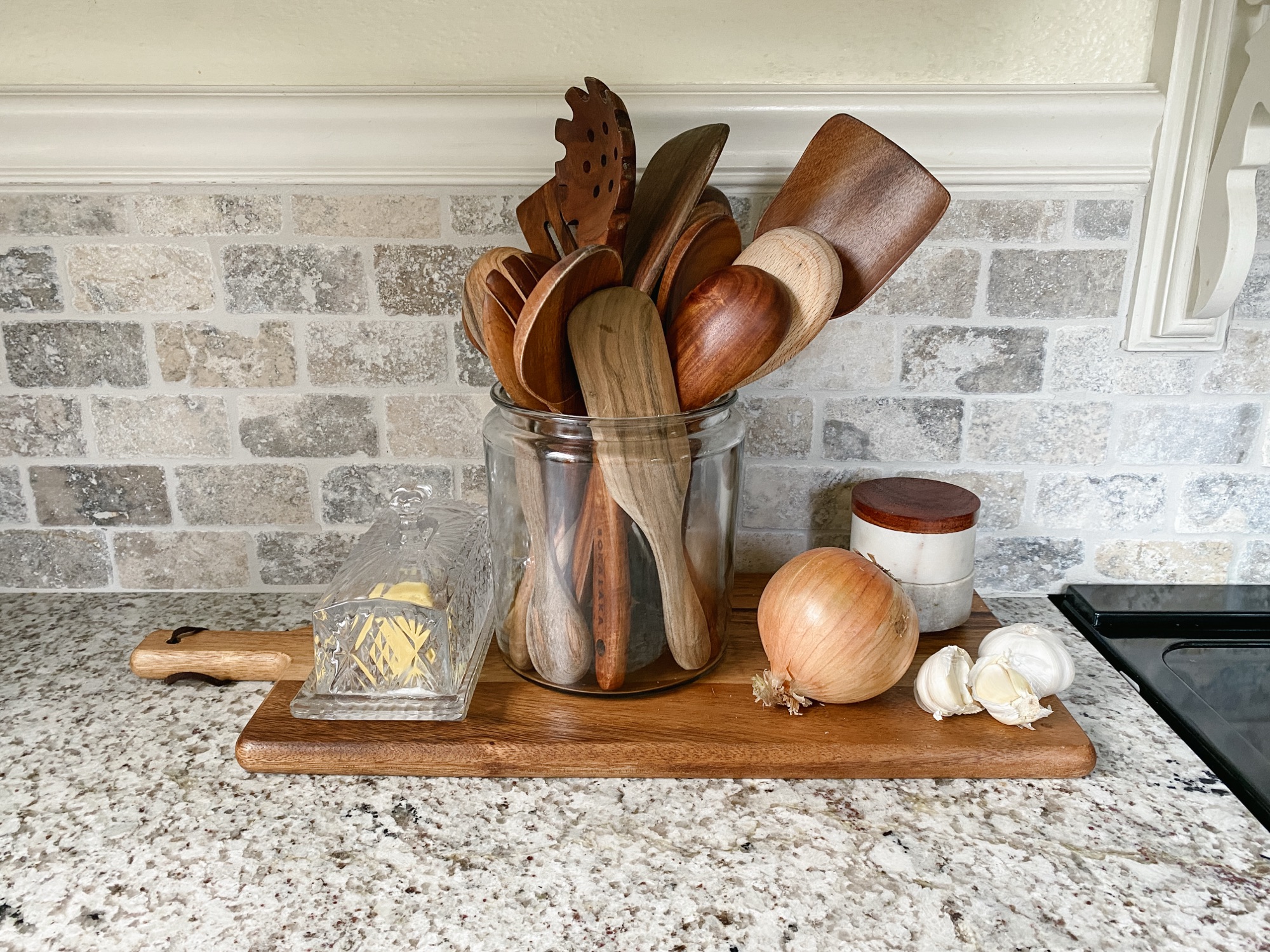
You can easily personalize your bedroom by adding one small vase for flowers, a small antique dish as a catchall, or an heirloom quilt at the end of your bed. Instead of surrounding your room with your entire collections, pick one favorite that you can use in a functional way. By doing so, you’ll keep your space peaceful and uncluttered.

On her side: a small carafe for evening water, original art for a touch of beauty, and storage boxes to keep daily items close but unseen. Serenity comes from thoughtful restraint.

Step Three: Layer Comfort & Care

Repeating tones, from the bamboo shade to the throw blanket and picture frames, bring warmth and cohesion. A reminder that subtle echoes of color and texture create harmony in a room.

Gen Z is known for not using “the big light.” They’re referring to the overhead light, which we call “ambient lighting” in the interior design world. In an area like a bedroom, I tend to agree with them.

Strategically adding lamps to a bedroom for accent and task lighting creates a much more relaxing environment than using “the big light.” I recommend lamps for your nightstands that are easy to reach and turn on/off without getting out of bed. You should be able to easily fit your hand under the shade to operate the switch or use a lamp that has a switch on the cord. If you have a reading chair in your bedroom, a floor lamp can be a well-thought-out addition.

Another way to create a relaxing environment for yourself is to consider your comfort and senses. Stay away from scratchy or uncomfortable fabrics that will be next to your skin. Consider whether candles, fragrance plug-ins, and even laundry detergents are overpowering your senses. No smell is better than a strong smell.

Lastly, consider your needs while you are in your room. If you frequently find yourself getting up for water, a carafe of water and drinking glass will be helpful to you.

Soft lamplight turns the bedroom into a sanctuary at dusk, offering a place to exhale as the day comes to a close.

Step Four: Invest in Quality Where It Counts

If you follow me on Instagram, you know that I love a good bargain and buying things second-hand. However, there are some things in the bedroom that I won’t compromise on. A good rule of thumb is, the closer it is to your skin, the higher quality you need to invest in. A good example of this is choosing bargain window coverings, but higher quality bedding. You won’t be laying down at night on your curtains, but you will be on the sheets.

When purchasing bedding, I recommend looking at thread count and fabric materials. If there isn’t a thread count listed, it’s most likely very low. High thread count sheets will last decades, so while the upfront cost may be marginally more, they will last incredibly longer than cheaper options… saving you money in the long run.

It’s also important to consider fabric materials. Fabric materials with descriptions like “knit, jersey, cooling” are less breathable than materials with long-staple natural fibers like Egyptian cotton. They are inferior materials that usually weave some sort of synthetic material made of plastic into the fibers. Synthetic materials don’t last very long and will need to be replaced in a short amount of time.

Most of us are on a budget, and it’s simply not realistic to invest in the highest quality of furnishings and accessories all at once for our spaces. I encourage you to make a point of switching things over one at a time until you have created a well-curated space that you deserve. Swap furniture made of composite materials for solid wood pieces, synthetic bedding for high-quality bedding made from renewable materials, mass-produced art for original art that reflects your unique personality. In this way, we create a collected space that truly becomes a haven in our home.

Layering textures – the quilt, duvet, and throw – adds depth and comfort. Each piece contributes to the feeling of being enveloped in warmth.

Step Five: Introduce Seasonal Color & Mood

I would be remiss if I didn’t point out the impact that color has on your bedroom haven. The psychology of color tells us that our emotions are subconsciously affected by the colors in our spaces. Restaurant owners, marketing professionals, and health care facilities understand that color goes beyond preference.

When choosing wall color, linens, and accessories in a bedroom, it’s important to understand the effects of your choices. I recommend tones with less saturation if you are trying to create a palette to anchor your room’s mood. Too much visual interest will hinder relaxation in a bedroom.

Today I am recommending a set of three colors, which can also be seen on the image below. Pale Oak, Cloud White, and Hale Navy are choices that you can bring into your space in a variety of ways such as furniture, bedding, lampshades, throw blankets, and artwork. They also provide a relatively neutral backdrop for you to add your personal touches that were mentioned above. If you can’t repaint your bedroom at this time, these three colors also tend to work well with a myriad of other colors.


Throughout this article I have mentioned things that I find to be useful in a bedroom space. You will find examples of these items in this curated list, which can be found by clicking HERE or clicking on the image below. You’ll find many more choices in this list than the ones pictured.

Click to shop from a list of suggestions for each of these areas.

Explore More from Falling for Home: A Weekly Autumn Journal

This article is part of my series called Falling for Home: A Weekly Autumn Journal. Be sure to check out these reader favorites:

You can subscribe here to receive new articles, seasonal inspiration, and vintage-style favorites delivered right to your inbox.

The Collected Kitchen

Welcome

Ask anyone to share memories of their life with you, and they’re bound to share one or two that involve time spent in a kitchen. The scent of celery and onions softening in butter. The bowl that was used for everything from mixing a brownie batter to holding popcorn on movie night. Perhaps they’ll remember music playing on the radio as the dishes were washed. When we gather as a family or with friends, we always find ourselves in the kitchen, the hub of the home. It’s the place where stories are swapped, hands are busy, and hearts come home.

Welcome back to the next installment of Falling for Home: A Weekly Autumn Journal. We’ve reached the midpoint of the series, as we’re journeying our way through topics that are dedicated to timeless seasonal living, traditional Southern décor, and creating a home you love year-round. If you’re just joining me, or you found your way here from Google, Pinterest, or Instagram, you can find links to the other articles in the series at the bottom of this article.

What Is a Collected Kitchen?

A collected kitchen is one that is curated by a combination of preference, utility, and time. You could go online to Amazon, eBay, or Etsy to order a complete set of items to mimic the look. But a truly collected kitchen evolves from time spent discovering what works for you. A collected kitchen is created by picking up items here and there to create a space of function and beauty that is uniquely designed for you.

The true beauty of a collected kitchen is that it’s not staged. The crock on the counter is there because it’s used every time the stove is turned on. The plate hung on the wall holds a memory of weekend antiquing adventures or the grandma who passed it on.

A collected kitchen isn’t sterile or empty. Chances are, you won’t see it on your Pinterest page. The counters will likely have things on them. Because we are using what we find to be the most functional and beautiful, everything isn’t going to match. If you’re looking for a “model home aesthetic,” you won’t find it in a truly collected kitchen. It’s a kitchen that feels like the warm heart of a home, one that’s inviting, personal, and well-loved.

Cream on Cream: A Canvas for the Seasons

We recently restored our 1939 kitchen. During that time, we added some custom cabinetry, installed new countertops and backsplash, and updated the flooring. The one thing that stayed in the kitchen and became a springboard for my whole design was some existing cream-colored cabinetry. As I was designing the space, I really evaluated how I wanted to feel and how it would reflect my personal style.

Truth be told, the kitchen is sometimes an overwhelming and overstimulating space for me. While my family loves my cooking, and I’m often told that I am good at it, it can be stressful for me. I needed my kitchen to be a calm space. I intentionally stayed away from bold colors and stark contrasts between materials. Using various shades of cream, along with natural wood tones in accessories, I created a space that allows me to cook in peace.

Another reason that I chose a monochromatic cream color palette was that it created a canvas for seasonal flexibility. I can mix in and swap out seasonal décor easily because I have a neutral backdrop. In fall, copper pieces warm the kitchen with a soft glow. During the winter holidays I can easily add some evergreen without clashing with anything. In spring, it’s easy to mix in pastel colors because they blend beautifully with the cream canvas that I created.

Objects That Work—and Tell a Story In My Collected Kitchen

Over the years I have found ironstone pitchers in various shapes and sizes. Some of them are the color of parchment paper with brown crazing that has deepened over time. Others, while over 50 years old, look almost new. I group them together to fill display spaces in our cabinetry, but I often get them down to use for floral arrangements or orange juice on a Sunday morning. As a group, in various shades of white and cream, they become functional art.

Through our glass cabinet doors, you can see stacks of milk glass mixing bowls and antique Ball jars. These don’t sit in storage behind glass as museum pieces that are too precious to use. Any time I’m baking, I’ll use either my vintage milk glass mixing bowls or my favorite yellow-ware bowls. The milk glass bowls are extremely thick and were made for durability that is non-existent today. I’ve actually dropped one on the kitchen floor, and it didn’t break!

An old plate rack that I picked up for $10 holds plates and platters that we use for meals. On top of the refrigerator, I keep an extra large wicker basket, which holds seasonal linens and works to fill a void between the top of the refrigerator and our tall ceilings. These natural elements add texture, warmth, and patina to create an authentically lived-in space.

The Working Kitchen Philosophy

We’ve all been in kitchens that are stark white with not a single thing on the counters. Or maybe you’ve seen a kitchen with open shelves that are full of framed photos and knick-knacks, but not a single cooking utensil. I can only wonder how much memory-making is being done in these kitchens. Are little hands making messes with flour while “helping” with the cookie dough? Are teenagers gathering to try their hand at cooking late at night?

When I look at the crock of wooden utensils next to my stove, I can tell which ones are the most used. My favorite spatula is worn smooth and the wood has lightened from years of washing it. It represents hundreds of meals cooked for family and friends – random Mondays and special Thanksgivings, nights after winning the game and mornings after being up with a sick baby.

A working kitchen is going to show signs of use, and I’m wondering when that began to be a source of shame. Why are we worried about being judged for using the most functional room in our homes?

Items I use daily for cooking are kept right next to the stove.

Paint Palette: The Warmth of Neutral Ground

Throughout the Falling for Home series, I have been sharing paint palettes that reflect the theme of each article. The Collected Kitchen inspired me to share a palette with two warm neutral tones for the wall and trim colors, as well as an accent tone that is reminiscent of patinated copper or vintage pantry paint. This gentle palette lets your meaningful pieces take the spotlight.

Shop the Look

I’m often asked about the vintage and antique pieces in my home. They have truly been collected over the years. You don’t need a full antique collection to create charm, just a few timeless touches that work for your space. If you’re interested in starting your own collection, I’ve compiled a curated list of timeless kitchen essentials, similar to the ones I own. You can click HERE to explore this list on LTK, or you can click the collage below to shop this style.

An Invitation to Embrace Imperfection

It’s easy to feel like our kitchens aren’t good enough to invite others into them. Maybe you’re just starting out, or perhaps you’re worried about being judged about functional “clutter” in your kitchen. Have you hidden away Grandma’s bowl for safekeeping, or are you afraid you’ll scratch your biscuit tin? Maybe you’ve seen the perfect English kitchen on Instagram or the curated collage on Pinterest, and you don’t feel like yours measures up. Whether you have laminate countertops or soapstone (I wish!), your kitchen can be filled with functional and beautiful vintage and antique pieces that are meant to be used and enjoyed daily.

I want to remind you that your kitchen is more than how it’s decorated. It is the most used room in your home, and it holds memories and meaning. Your family and friends aren’t there to judge you by the plates your meals were served on. They’re going to remember the flavors they experienced, the conversations they had, and the memories they made. Don’t wait to start making those memories until you feel like your home is show-worthy. Send the invitation. Cook for your family.

Explore More from Falling for Home: A Weekly Autumn Journal

This article is part of my series called Falling for Home: A Weekly Autumn Journal. Be sure to check out these reader favorites:

You can subscribe here to receive new articles, seasonal inspiration, and vintage-style favorites delivered right to your inbox.

The Velvet Season: Using Texture and Rich Tones in Fall Home Decor

A Five-Year-Old’s Treasure

When I was about five or six years old, I walked a couple of houses down the street to a neighbor’s yard sale. The driveway was lined with various unrelated items my neighbor was hoping to sell. One of those things was a harvest-gold crushed velvet throw pillow. To an adult, it was probably a hideous 1960s relic from a musty basement. But when my small fingers touched that fabric- velvet for the first time- I thought it was the most luxurious thing of beauty that I had ever seen.

Being a child, of course I didn’t have any money to buy it, but I returned several times that day to admire the velvet pillow. Finally, at the end of the day when the lady was packing up her unsold items, the pillow remained, and she gave it to me.

Even now, decades later, I still believe that there’s something decadent and luxurious about a well-placed velvet pillow. It makes the whole room seem more cared for.


This is the third entry in the Falling for Home: A Weekly Autumn Journal, a Friday series dedicated to timeless seasonal living, traditional Southern décor, and creating a home you love year-round. (Find links to previous entries at the bottom of this post.)

A Season of Layers and Light

During the weeks of late summer to early fall, it feels like a quiet transition. Supple textures like velvet mimic the season’s natural softness. The transition to spring is dotted with turbulent thunderstorms, and the starkness of winter jolts us with its biting winds. But the South seems to float imperceptibly from summer to fall. It’s a soft and gentle glide into the autumn season, like fingertips trailing across velvet.

It’s easy to feel the pressure to head to a big-box store each season to buy the newest décor available for our homes. However, today I want to talk about intentionally investing in a few timeless, quality pieces that we can layer with our existing, collected décor to decorate for fall. In this way we will invite calm, rather than clutter, into our homes. We’ll use our creativity in ways that will repurpose objects we own and love with a few new things that we find along the way.

Touchpoints of Texture – Decorating the Living Room

When my kids were small they had several beloved “stuffies.” You know, those precious stuffed animals with ears rubbed thin and matted fur that was once fluffy. However, after a few years’ worth of birthday parties, I quickly learned that if a family member asked what one of the kids wanted for their birthday, my response included that we didn’t need any more stuffed animals.

Throw pillows are our grown-up version of stuffed animals. They really are! Unfortunately throw pillows take up a lot of storage space in our homes. My solution to this is to invest in some quality pillow inserts and only buy pillow covers. Not only does this save on storage, but it’s far cheaper to buy pillow covers than the whole throw pillow.

This season I traded the navy blue pillow covers that I used throughout summer for some rich, copper colored velvet ones. If you’re looking to switch your pillow covers this fall, aim for saturated tones like copper, plum, or chocolate. If you want to add more texture to your space, consider tactile materials like velvet, raw linen, or boucle.

In addition to switching out your throw pillows, another great addition to your fall décor are copper and brown glass pieces. These are easy things to “hunt” for throughout the year as you’re antiquing. A copper boiler or basin can be used to hold books, magazines, and even throw blankets. A collection of brown and amber vases set in front of a window catches the fading sunrays to cast a magical glow around the room.

As you decorate for fall, don’t overlook lighting. When the daylight grows shorter, we have opportunities in the evening to create a warm, cocooned glow that invites rest with well-placed lamps and even candles. Lighting is a way to add to the rhythm of the season and awaken our senses to calm and comfort. The glow of a lamp in the corner of your living room or the flicker and scent of an autumn candle invites us to the small moments that spark peace within.


Many of my favorite fall items that I used throughout our home this season can be found in this curated grouping on LTK. You can either click HERE to find the complete list, or click the image to be taken directly there.

The Velvet Ribbon Effect – Small Luxuries

If investing in new décor isn’t in your budget this year, or you feel like you already own enough of it, there are ways to take your existing décor up a notch to freshen it up. A budget-friendly fall décor update is using some velvet ribbon. Taking ordinary objects like a stack of books, a candle, or even a piece of artwork, and tying a length of velvet ribbon around them, will transform the ordinary into a piece of intentional seasonal décor.

Well placed bits of velvet ribbon transform ordinary objects into decorative pieces fit for the autumn season.

You can find seasonal velvet ribbon at craft stores or online. Look for shades like cinnamon, olive, rust, or plum to layer with your existing palette.

In my home, I used seasonal toned velvet ribbon around a stack of books, a little amber vase, and large brown bottles. It changed them from ordinary objects into objects d’art. It’s the slightest changes– a bit of ribbon, a tempered light – that tell us it’s time to slow down in this next season.

Permission to Linger

Will this be the autumn that you finally allow yourself to linger? I want to gently encourage you to embrace the comfort that you create in your own home without rushing into the chaos of the holidays. Remember, when you invest in your own home this season, that quality is better than quantity, collected is better than consuming, and luxury can be quiet and accessible. I invite you to observe your own home and find ways to soften your décor this season.

Invitation

Thank you for joining me with this week’s article from my series Falling for Home. Each Friday from August through September, we’ll meet here at BelleAntiquarian.com to reflect on a slow, intentional rhythm of seasonal living, rooted in tradition, home, and memory. Join me next week for Chicken Mull, a lesser-known Southern heritage recipe.

Never miss a post – use the box below to receive the latest Belle Antiquarian articles directly in your in-box. Want to see more of our daily lives? Find me HERE on Instagram.

Explore More from Falling for Home: A Weekly Autumn Journal

This article is part of my Falling for Home series. Be sure to check out these reader favorites:


Each week during the Falling for Home series I am featuring a paint color palette inspired by the topic we discussed. The Velvet Season inspired me to create a moody, rich palette that brings velvet textures and antique finishes to mind. Perfect for living rooms, libraries, and layered interiors.

How to Update a 1930s Bathroom Without Losing Its Charm

Updating a historic bathroom doesn’t have to mean losing its original charm. Our 1939 bathroom still features the vintage wall tile and fixtures that first caught my heart, but a few thoughtful additions gave the space new life. By keeping the original tile and layering in a teak table, relaxed roman shade, coordinating artwork, and a touch of live greenery, I created a bathroom that feels both timeless and livable. If you’ve ever wondered how to refresh a 1930s bathroom without replacing its historic character, you’ll love this approach. I’ve also included a Benjamin Moore color palette inspired by the original tile, perfect for anyone looking for bathroom design inspiration rooted in history.

Historic Bathroom at First Glance

The first time I saw the main bathroom in our 1939 Colonial Revival Home, I knew it wasn’t living up to its full potential. It’s a rather large bathroom for its era, full of the original soft peach tile on the walls and in the shower. The original bathtub is cast iron with a porcelain enamel finish. It’s very large compared to modern bathtubs. These were elements that I found to be valuable and desirable while looking for a historic home to purchase, and I wanted to honor them in my design.

The bathroom as it looked when toured prior to purchasing the house.

When we viewed our home prior to purchasing it, the large space under the window had a tiny vanity and some wall shelves. After purchasing it, I wanted to update it in a way that made it more functional, while keeping the vintage charm typical in a 1930s and 1940s home. Since nothing was broken, I was able to update without replacing anything major.

The walls in the whole bathroom have peach-colored tile. In this photo you can see a built-in storage cabinet that is set into the wall.

Refreshing a 1930s or 1940s Bathroom

As you might guess, the peach tile was the springboard for the whole design. This color might have been a reason other homeowners would have ripped it out. However, I knew that finding the right paint color to complement the peach would create a better feeling in the space. For the walls above the tile, I went with Benjamin Moore China White OC-141.

Again playing with peach tile, I leaned in a bit to the orange tones, and selected a teak table to place under the window. I also added a relaxed roman shade over the window blinds to soften the edges of the window. A lucky find, the seagrass basket was a clearance rack find, and it fits perfectly on the bottom shelf of the table.

Next, I added a few plants to the space. The live greenery adds a spa-like touch, and brings in green as an accent color. The last selection that I made for this design was the artwork. It’s the only artwork in our whole house that isn’t an original piece, but it brings together all of the colors in this bathroom perfectly.

Best Paint Colors for Bathrooms with Vintage Tile

The color palette for this bathroom is built around the original 1939 bathroom tile. For a similar color in wall paint, use Benjamin Moore Clementine Rose 1219. A complementary neutral trim color is Benjamin Moore China White OC-141. If you’re looking for an accent color that pairs well with the other two colors, try Benjamin Moore Paris Rain 1501.

Adding Modern Comfort to a Historic Bathroom

I hope this inspires you to rethink a total remodel. There are many ways to add modern comfort to a historic bathroom without gutting it. For us, the space functions well and the original tile and fixtures are in fantastic condition. (What you might not be able to tell is that the built-in cabinet is set deep into the wall, so we didn’t have a need to create additional bathroom storage.)

I know there’s a temptation from social media, TV, and Pinterest to “update” every space that isn’t decorated in a modern way. But the best way to truly honor a historic home is to allow it to be what it was built to be. Most historic homeowners will embrace the imperfections and charm of designs from by-gone eras.

The finished design. A 1930s vintage bathroom with modern comfort and classic accessories.

Shop This Look

If you see something you like in this design that you’d like to incorporate into your own space, you can find many of the items linked HERE for shopping.

Click to Shop

While You’re Here…

While you’re here, I hope you’ll take a few minutes to “look around” and read a few of our other articles. We’re currently in a series called Falling for Home: A Weekly Autumn Journal, which is all about falling in love with our own homes again as we meander through the autumn season together.

Let me know what you think of these bathroom colors in the comments below. Would you ever live with peach colored tile?

When Summer Lingers: Late Summer to Early Fall Home Decor Ideas

The First Golden August

It was August, and the kitchen was half-gutted… yet I loved it. We had only been in our 1939 Colonial Revival home for a few short months. Boxes of floor tile were stacked in corners, appliances were missing, and decisions layered like dust on every surface. But in the late afternoon, as the summer sun tilted toward evening, our old house glowed with promise.

I remember standing in the quiet, listening to the hum of the ceiling fan and the soft creak of the old wood floors, and thinking, “We’re really here.”

We didn’t yet know where things would go, which paint color would win, or how the new kitchen would come together. But the bones of the house were good, and the light was kind. In that golden August, it felt like the house was giving us space to figure it out, letting us breathe.

This year, I wanted to honor that in-between season, where summer lingers and fall waits just outside the door.

Falling for Home is a new weekly series dedicated to this gentle shift: a way to celebrate the spaces we live in and the beauty of making them feel like ours. Over the next few weeks, we’ll look at meaningful ways to transition your home from summer to fall. Today, we begin by sharing a conversation on how to style your home between seasons.

The Beauty of the In-Between

It feels like so much of the year is spent rushing from one holiday to the next. There aren’t many months on the calendar when we don’t feel the pressure to decorate the mantel for one occasion or another. In August and September, the days are still long, and we can still enjoy the evenings outside after dinner. In the South, it certainly won’t feel like fall until we’re well into October. But we’re also back into our normal fall routines of school and work.

There’s a temptation to rush into what we’re longing for. By August, we are tired of the sweltering heat and oppressive humidity. Simply put, we’re over it. We know crisp breezes and chilly evenings are coming soon, and in anticipation, we feel the pull to sprinkle the house with pumpkins and all things fall. And instead of allowing ourselves to look forward with quiet excitement, we try to force the season into already being here. I’m over summer, so I’m decorating for fall.

What if we waited, though? What if we gave ourselves permission to linger in the in-between? To pause before the rush of Hallo-Thanks-Mas? There’s value in this transitional space. A restful hush. A moment to recharge. We can give ourselves a period of intentional rest, one that renews our creativity for what lies ahead, if we find rest in the lull of August and September.

The last of the zinnias that I planted in early spring can still be found on my kitchen counters.

A Gentle Transition: Letting Your Home Breathe

In this time of transition from summer to fall, I am choosing to let my home breathe. I am still using my light gauze blanket that is a “barely there” covering during the warm evenings on the porch. The melamine dinnerware is still getting plenty of use as we take advantage of the sunlight to eat outside many evenings. Most days I am still filling vases with zinnias for the kitchen table. The windows are still open in the morning, and the cicadas hum well into the evening.

I’ve packed away all of our patriotic decorations that we had out from May through July. Instead of replacing it with other décor, I’m letting those spaces be empty for a bit. If I really need to swap it out with something, I’ll use something plain or neutral. It becomes a restful place for the eyes to land during a time of “in-between.”

In preparation for the next season, I browse the thrift and antique stores for items of amber glass, brown transferware, and pieces of copper or brass here and there. As slowly as the leaves turn in fall, I may sprinkle a special piece of collected décor into a bookshelf or the dining room sideboard. The rest are put away until it’s time for the next season. This feels different than pulling a big bin of fall décor up from the basement. I am not rushing. The warmth of summer is still welcome. And less feels like more during this time, because it’s intentional.

In late summer, I focus my thrift shopping on collecting items for the upcoming fall season. Warm copper, amber glass, earthy baskets, durable yellow-ware & oven-safe bowls are lovely to both decorate with & use in the home.

In My Home

On the fireplace mantel, I’ve taken down the cluster of American flags that filled the silver vessels and replaced them with pheasant feathers. Instead of the garish orange and black of Halloween, which will have its time, there’s a subtle nod to harvest ahead.

The kitchen counters have been covered in ripening tomatoes all summer. As the last of the tomatoes slowly comes off the vine, the counters are making room for an early butternut squash and a bowl full of apples. Fall, we see you, but you’re not here yet.

In the dining room, where we’ll gather so many times together as a family in the coming months, the sideboard is lightly styled with a simple linen runner and a stack of vintage books tied in velvet ribbon. Subtle clues that the seasons are on the cusp of changing.

Invitation

As we walk through the doors of our favorite big-box stores, it’s easy to feel like we’re behind. It was just the 4th of July, yet Halloween décor is on clearance, and boxes of Christmas ornaments line the shelves. It’s okay to linger in summer for a while. It’s okay to stop the cycle of, “I’ll be happy when…” and “I can’t wait until…”

In this series, Falling for Home: A Weekly Autumn Journal, we’ll take a slow, intentional walk from summer to autumn, falling in love with our homes again through shared traditions, inspired recipes, and timeless, collected décor.

Perhaps fall hasn’t fully turned just yet… and maybe, that’s the very best part.

Colors for the Season

Each week during the Falling for Home series I am featuring a paint color palette inspired by the topic we discuss. When Summer Lingers inspired me to create a graceful palette thing bridges summer and early fall. The warm cream and the soft white are elevated with a green that nods to the fading garden.

Thank you for joining me with this week’s journal entry from my series, Falling for Home. Each Friday from August through September, we’ll meet here at BelleAntiquarian.com to reflect on a slow, intentional rhythm of seasonal living, rooted in tradition, home, and memory. Join me next week for Gathering Baskets & Dried Blooms, a post about saving and savoring the beauty around us at the end of summer.

For sources to items featured in this post and others inspired by the season, find them HERE in my LTK shop, or click the image below to shop.


Explore More from Falling for Home: A Weekly Autumn Journal

This article is part of my series called Falling for Home: A Weekly Autumn Journal. Be sure to check out these reader favorites:

You can subscribe here to receive new articles, seasonal inspiration, and vintage-style favorites delivered right to your inbox.

Creating a Cozy Summer Reading Spot: Southern-Inspired Porch and Garden Retreats

If I think back to the summers of my childhood, the memories that stand out most are filled with adventure and journeys to far-off lands with friends whose names I couldn’t always pronounce. I’d lay flat on the cool floor, escaping the Southern heat as I read my way through stories brought to life by authors like Frances Hodgson Burnett, Roald Dahl, and Lucy Maud Montgomery.


These days, on certain golden afternoons, the light on our sleeping porch turns honey-colored, and the only sounds are the hum of cicadas and the dogs snoring nearby. That’s when I return to the same quiet habit of reaching for a book with a well-worn spine and a story that stretches out like a July day.

That’s where the idea for my dedicated reading spaces began. A soft place to sit, a lamp, a light blanket, and a little side table for a cool drink. Nothing fancy, just a small retreat tucked into the edges of our home.

If you’ve ever dreamed of a quiet corner like this, a retreat made just for you, I hope today’s article will show you just how easy and beautiful it can be. This post is part of Old-Fashioned Summer Saturdays, a weekly series where I share timeless Southern joys, from gardening and seasonal recipes to vintage-style living. If you found your way here from Instagram, Pinterest or Google, I’m so glad you’re here. I hope you’ll stay a while and explore the other articles in the series.

A cozy spot to read a book. A floral couch has a plaid pillow, a lightweight cotton blanket, and an open book. The table next to the couch is a white marble top with an iron stand. On top of the table are plants and a lamp. The room is full of windows showing trees outside.

Why You Need a Summer Reading Retreat

Creating a cozy summer reading spot is about so much more than decorating a corner of your home. We are constantly bombarded with screens, alerts, and noise. Carving out a small space for yourself (a place to rest, reflect, and read) is an act of care.

It doesn’t need to be perfect. It just needs to be yours.

By intentionally designing a retreat, you’re choosing a lifestyle that’s slower, purposeful, and deeply comforting.

Choosing the Perfect Spot, Indoors or Out

When looking for a spot to dedicate to reading this summer, consider the kind of environment that soothes you.

– Do you enjoy a warm breeze, the sound of wind chimes or cicadas, or the smell of garden flowers?
– Is a hammock or shady porch your idea of heaven?
– Or do you prefer the feel of a ceiling fan and the hum of the air conditioner indoors?

Even a corner by a window can become your reading haven with a few thoughtful touches.

This year, I created two reading spots, one indoors and one out. On our sleeping porch, I open the windows and turn the ceiling fan on low. I keep a small table nearby to set down my sweet tea and bookmarks.

Outside, I’ve placed a comfortable chair in the shade garden on our deck. There’s a little side table and a cordless rechargeable lamp for when the light begins to fade. It’s peaceful, quiet, and entirely mine.

Layering Southern Charm and Comfort

As you’re thrifting or antiquing this summer, keep your reading nook in mind. You might find the perfect wicker chair or vintage iron rocker. Or maybe you’ll spot a plant stand that becomes a charming little table with the addition of a tray.

Here are some ideas to inspire your setup:
– Seating: Wicker, wood, or vintage metal chairs layered with soft cushions and a light quilt
– Tables: Repurposed plant stands, small stools, or antique side tables
– Accessories: A linen napkin as a coaster, a glass of iced tea, a jar of flowers from the garden
– Lighting: A small table lamp, string lights, or a vintage-inspired cordless lamp

If you’re going for a vintage look, or just prefer to shop online, I’ve linked a few of my favorite finds HERE and in my LTK shop.

A collage of recommended items that can be used to create a cozy summer reading spot. Included are comfy chairs, side tables, lamps, a light blanket, and some books,

Favorite Books for a Southern Summer

There are certain stories that seem to belong to this season. When I think of summer reading, these titles immediately come to mind:

Fried Green Tomatoes at the Whistle Stop Café
The Secret Garden
Divine Secrets of the Ya-Ya Sisterhood
Where the Crawdads Sing

You can find my full list of summer book recommendations HERE, or click the photo below to shop.

Your Own Slice of Stillness

I encourage you to create your own cozy summer reading spot, somewhere quiet and beautiful, made just for you. It doesn’t take much. A little time. A few thoughtful details. And the decision to rest.

Imagine how rested and refreshed you’ll feel at the end of the season, having given yourself the gift of a little peace, a little story, and a little corner to call your own.

I always look forward to hearing what others are reading, and I’d love to know what’s in your summer stack. Let me know in the comments below!

Explore More from Old-Fashioned Summer Saturdays

This article is part of my Old-Fashioned Summer Saturdays series, where I share timeless inspiration for warm-weather living. Be sure to check out these reader favorites:

Timeless Red, White, and Blue Decor Ideas for the Porch
Heirloom Tomato Dreams
Classic Summer Whites: Timeless Linen Dresses and Southern Style Staples
Refrigerator Pickles—A Southern Summer Staple
Simple Garden Joys
Old-Fashioned Strawberry Shortcake Cake
Blue and White China for Summer Entertaining
You can subscribe here to receive new articles, seasonal inspiration, and vintage-style favorites delivered right to your inbox.

P.S. I’m giving away a little something to help stock your summer book basket—details are on Instagram!

A colonial revival home decorated for the summer with red, white, and blue buntings hanging over the windows

Timeless Red, White, and Blue Decor Ideas for Summer Porch Styling

Welcome to the first post in my Old-Fashioned Summer Saturdays series, where each week I’ll share simple, nostalgic, and meaningful ways to celebrate the season at home. From time-honored recipes to classic garden scenes, this series is all about the slower pace of summer and the beauty of tradition.

There’s something so heartening about red, white, and blue bunting waving gently in the breeze. For me, decorating for summer is more than just patriotic; it’s personal. This year, as we honor Flag Day and the birthday of the United States Army, I’m reminded of my husband’s service and the pride that lives in the rhythm of our everyday life.

Here are a few timeless ways I decorate our home’s exterior for summer. Classic touches that honor tradition and transition seamlessly from Memorial Day through Independence Day.

A woman walking up the steps towards the doorway to a colonial revival home that is decorated for summer

1. Classic American Bunting

Hang red, white, and blue bunting across porch railings, below windows, or above entryways. Choose cotton or canvas styles with a vintage feel for a more authentic look.

2. Small Garden Flags or Stake Flags

Line your front walkway or flower beds with small American flags. It adds a layered look and creates a warm, welcoming lath.

3. A Seasonal, Patriotic Wreath

Create or purchase a wreath that includes hints of Americana. Think navy ribbon, white hydrangeas, or tiny vintage flags. Wreaths can be understated and transition easily into mid-summer.

A woman hanging a patriotic wreath on a black front door of a colonial revival home.

4. Grouped Vintage-Inspired Decor

Display red, white, and blue vintage containers, like enamelware, watering cans, or milk jugs, on porch steps or tables. Fill them with fresh flowers or ferns for a charming touch.

5. Timeless Lighting

String cafe lights or place solar powered lanterns near your seating area. Add a soft glow for evening porch sitting during warm weather nights.

Decorating for Flag Day and Beyond

If you’re looking to create a home that feels patriotic without being overly done, focus on balance. Mixing textiles with plants and keeping a restrained color palette lets your decor feel thoughtful, not theatrical.

Want to bring this look to your home?

Check out my curated list of red, white, and blue home accents that work all season long.

This is just the beginning of what I hope will be a summer full of simple pleasures and old-fashioned charm. I’ll be sharing a new post every Saturday, from garden stories to vintage recipes and everything in between. Until then, I hope this inspires you to dress your home in a way that feels meaningful and full of heart.

Stay tuned, and happy summer.

A colonial revival home decorated for summer with red, white, and blue buntings, American flags, and flowers

Explore More from Old-Fashioned Summer Saturdays

This article is part of my Old-Fashioned Summer Saturdays series, where I share timeless inspiration for warm-weather living. Be sure to check out these reader favorites:

Simple Garden Joys
Heirloom Tomato Dreams
Classic Summer Whites: Timeless Linen Dresses and Southern Style Staples
Refrigerator Pickles—A Southern Summer Staple
Creating a Cozy Summer Reading Spot
Old-Fashioned Strawberry Shortcake Cake
Blue and White China for Summer Entertaining

You can subscribe here to receive new articles, seasonal inspiration, and vintage-style favorites delivered right to your inbox.

a summer table scene with lemons in an antique bowl, cutting board, yellow and white checked tablecloth, and lemon napkins

How I decorate for Summer Without Spending a Dime

Summer decorating doesn’t have to cost a thing. In fact, some of my favorite seasonal touches come from using what I already have. Here’s how I refresh my home each summer without spending a single dime.

1. Seashells and Natural Finds

A collection of shells from past beach trips is all it takes to bring that breezy coastal feeling indoors. I display mine in antique bowls, baskets, and even old jars.

an antique blue willow bowl filled with collected seashells, the lid to an antique cracker jack tin, a small american flag

2. Shop Your House by Color

Red, white, and blue is a classic combo that’s easy to work with if you start gathering. I pulled books, quilts, vases, and other small accents in these shades and grouped them together for an instant Americana feel.

3. Use Family Photos as Decor

I pulled out a few favorite summer photos of my kids from when they were little, especially ones where they’re wearing patriotic outfits or playing outside. Tucking these into frames I already own brings personality and memories into the room.

4. Reuse What You Already Own

I’ve saved flags, fans, and table linens over the years, and I bring them out every summer. They might not be perfect, but that patina is part of the charm. Don’t be afraid to use what you love!

5. Clip from the Yard

You don’t need a florist to make a summer statement. I clip fresh greenery or blooms from the yard and pop them into vintage jars or pitchers. It instantly freshens up any room…for free!

6. Use Fresh Seasonal Fruit as Functional Decor

Summer fruit isn’t just for eating; it can double as a beautiful, budget-friendly centerpiece. I like to display peaches, lemons, or limes in a vintage bowl or colander on the kitchen counter or dining table. It’s a simple way to add color, texture, and that fresh summer feeling, while using what you’re already buying. Bonus: it’s practical and gets eaten before it spoils.

7. Rearrange for a Fresh Look

One of the easiest no-cost ways to freshen up is to simply moves things around. Switch throw pillows from one room to another, restyle your shelves, or flip patterned pillows to the plain side for a lighter, airier look.

Decorating for summer doesn’t require a shopping trip, just a little creativity! Whether it’s pulling out old family photos, styling shells from a beach trip, or clipping hydrangeas from the yard, the most meaningful decor often comes from the things we already own.

Which idea will you try first? Leave a comment and let me know how you’re decorating for summer on a budget!

Essential Elements for a Beautiful Entryway

It’s the beginning of a new month, which means it’s time to release another designed space. This month’s design plan features an entryway 3 ways: casual, formal, and transitional.

This article contains affiliate links and ads. You can find the products I recommend by clicking on the links throughout and at the bottom of this page. These are designs that you can pick and choose which elements to bring into your own spaces. They’ll be saved here on my website, or you can save them on Pinterest. You can come back and add pieces to your spaces as time and budgets allow.

This month I am sharing what I consider to be the perfect recipe for a successful entryway design. The best entryways have the following essential elements in common:

  • a functional piece of furniture
  • a lamp
  • artwork
  • a mirror
  • storage/catchall
  • something alive/fresh
  • a rug
  • a clock
  • and a place to set a wet umbrella.

Not only do these items create a beautiful space, but they are functional as well. For example, the mirror allows residents and guests to check their appearance before coming and going, as well as reflecting light into the space. A lamp allows residents to find their way inside on a dark night, as well as helping guests find the door on their way out.

Below you can see a colorful and vibrant entryway design. Since the entryway is the first impression of your home, it’s an opportunity to create a space that reflects your personal style. This design leans more towards casual and bohemian. It is full of visual interest and layers of texture. Combining two separate pieces, like the green and white plate and the pink framed artwork, you can create a one-of-kind, original piece of art in your home that no one else will have. Try using Command brand hooks to mount the plate on top of the pink art before hanging it on the wall.

Click the photo to shop for these exact items.

Traditional decor thrives on symmetry. The design below uses symmetry to create balance by flanking the mirror with matching lamps and plates from the same series. While the first design is considered modern and casual, I would consider the design below to be formal.

Click the photo to shop for these exact items.

Entry Table

Below you will find the final entryway design for this month. Notice how similar metal tones and a soft ivory color are carried throughout. Natural materials like wicker, marble, and wood counterbalance the glamorous gold and brass to create a sophisticated but approachable space. This design is a midway point between casual and formal.

Click the photo to shop for these exact items.

In many cases, the front door to the home opens directly into the living space without a designated foyer or entryway. In these situations it’s possible to create an entryway by grouping specific items on a wall next to the front door. Are you missing any of these essential items in your entryway? Do you have any items in your entryway that you would add to this list? Let me know in the comments below.

Never miss a design release in the future by subscribing using the box at the bottom of this article.

You can find many of these items in my LTK Storefront HERE.

Transforming Our Breakfast Room: A Makeover Journey

Today I am sharing some before and after pictures of the breakfast room in our 1939 home. This is the casual dining space in our home that we use for our everyday meals, playing board games, and doing puzzles.

Our breakfast room is off of the kitchen, and has also has a door to the center hallway on the main floor. One of the things we love about living in a house that is not open concept, is that we can dedicate rooms to the functions we need and completely close the room by shutting the doors to it.

Before, the previous homeowners used this space as a family room.
After, we restored the space to its original purpose, a breakfast room.

The previous owners were using this room as a family room. They were using a sectional sofa that took up the entire room. The walls were painted a sherbet orange color with a lighter orange color on the ceiling. The only light in the room was a pendant fixture that was so dark we couldn’t tell if it was on unless we opened the yellow glass shade.

Before, a large sectional filled the entire room.
After, the space is restored to its original purpose, a breakfast room.

We transformed this space by painting the walls Benjamin Moore “Pale Oak” and the ceiling “White Dove.” Our general contractor gave us a handmade stained glass shade that his father had made. The shade is far from perfect and a little uneven on the edges, but we loved it for this space. I found a pendant online that could accommodate the shade.

The orange paint colors on the walls and ceiling were not appropriate for the room. The windows have south and west sun exposure, which means direct light comes into the room for most of the day. As a result everything in the room took on an orange glow. Combined with a light fixture that wasn’t functional, this was a space that no one in our family wanted to be in.

After I corrected the color on the walls and installed a functioning light fixture, the breakfast room was completely transformed. The total cost was around $250 for the paint and a pendant fixture. The breakfast room isn’t completely done. We’re on the hunt for a very specific table and chairs. I’m also deciding what to put on one of the walls. But I wanted to share how simply changing the paint and lighting can completely change a room.

I’d love to see how you transform your own spaces with paint. Be sure to tag me on Instagram or comment below to share your photos!